
The Best Fluffy Pancakes recipe you will fall in love with. Full of tips and tricks to help you make the best pancakes.


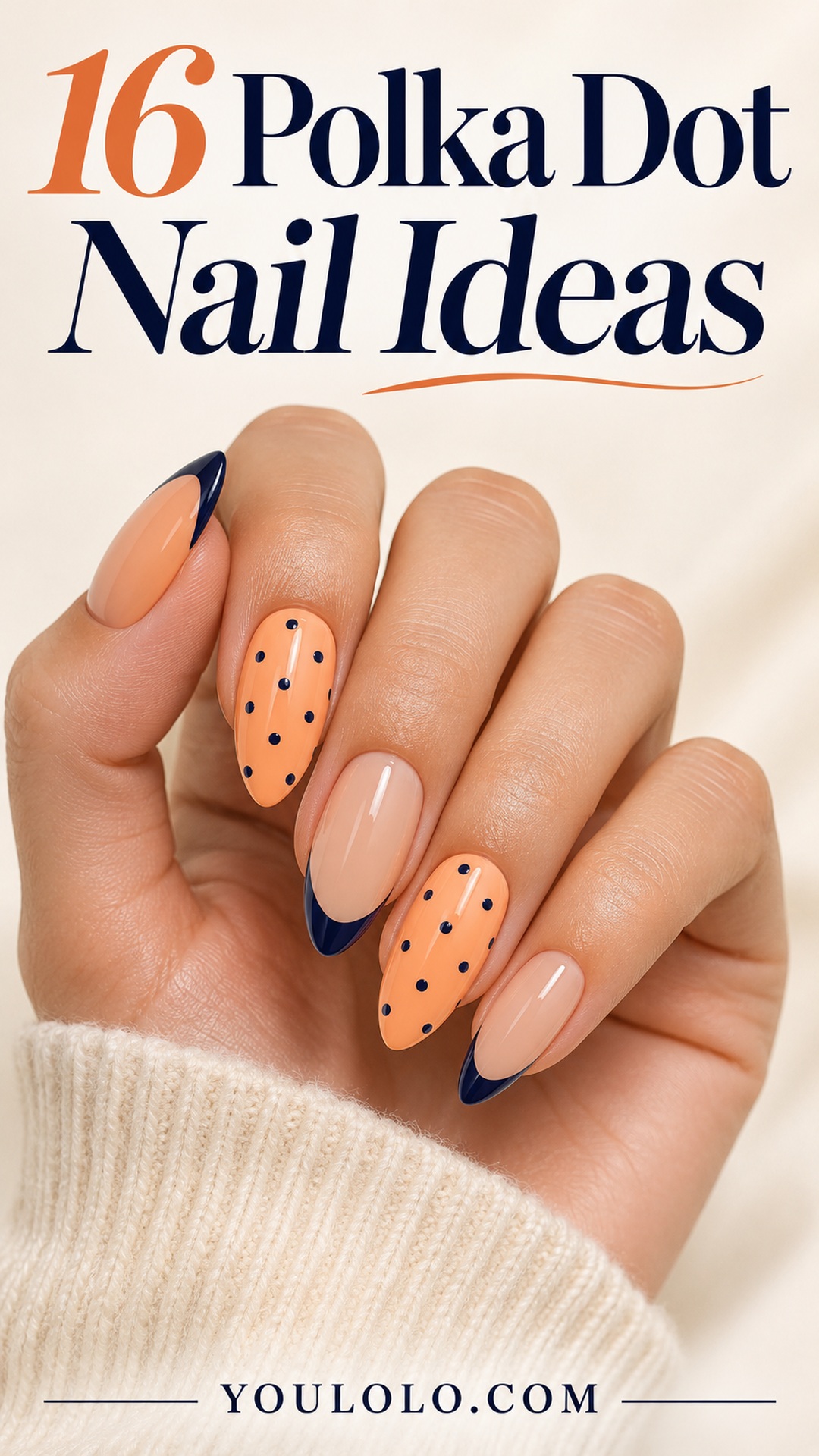
Polka dot nail ideas can look delicate, graphic or richly colored depending on three choices: the size of the dots, the space around them and the contrast with the base. You do not need to cover every nail in the same print. A dotted edge, a single patterned accent or a reversed color pairing can make the whole manicure feel more intentional.
The images below are original AI-created Youlolo design concepts, not photographs of completed client manicures. Use them to discuss color, shape and artwork with your nail artist.
How to choose polka dot nail ideas for your nail shape
Begin with the size of the nail surface you actually want to wear. Short rounded nails can carry a clear dotted pattern, but they usually benefit from fewer marks. Longer almond nails offer room for a curved border or a gradual change in dot size. Neither shape needs a dense print to look finished.
Next, decide how strong the contrast should be. A dark dot on a pale base reads clearly from a distance. Related shades, such as lavender and plum, create a softer effect. A metallic dot changes with the light, so check a sample rather than judging it only by the polish bottle.
Choose one organizing idea. It might be an all-over repeat on two accents, a crescent at the tip or an open halo. Once that layout is clear, the other nails can stay plain. If you add a line or a French edge, repeat an existing color so the extra detail feels connected.
For a softer base, compare our pink gel manicure ideas. If you prefer detail concentrated at the edge, browse these milky French manicure ideas.
1. Ink and Apricot
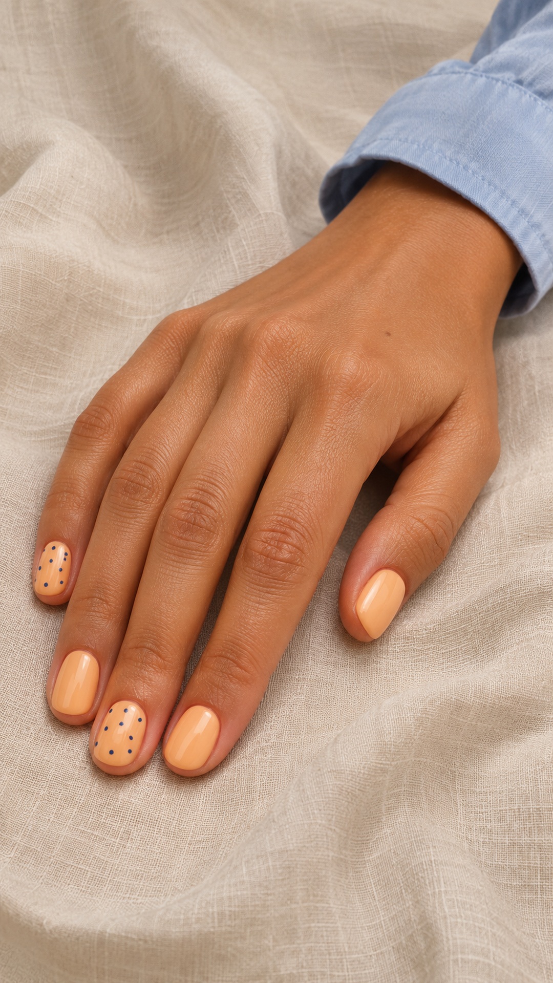
Apricot makes a warmer background than bright white, while ink-blue dots bring enough contrast to keep the tiny pattern readable. The two decorated nails act as the focal points; the solid ones give the eye a place to rest. This is a useful starting point if you like playful prints but want the finished manicure to feel considered.
Make it yours: Ask for the dots to stay small and evenly separated. On very short nails, reduce the number of dots rather than squeezing them into a tighter pattern.
2. Espresso Dot Crescents
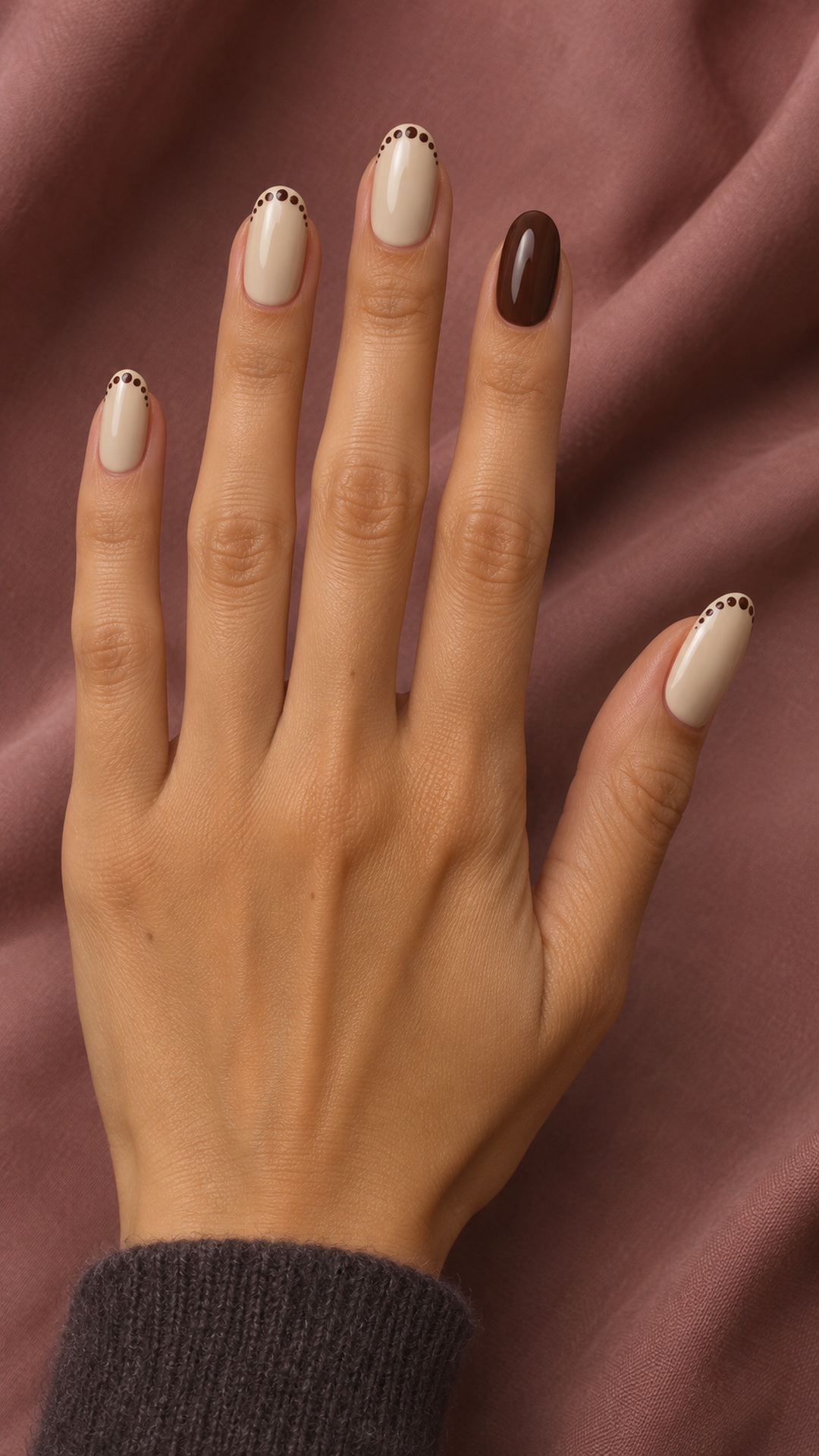
An espresso crescent gives a dotted manicure a clear direction without covering the entire nail. The creamy base leaves plenty of open space, so the arc remains visible even at a distance. A solid brown accent connects the tiny marks to the rest of the set and keeps the palette from feeling too delicate.
Make it yours: Agree on whether the arc follows the free edge or sits slightly below it. Keep the curve consistent across nails, while allowing the number of dots to change with nail width.
3. Pistachio Porcelain
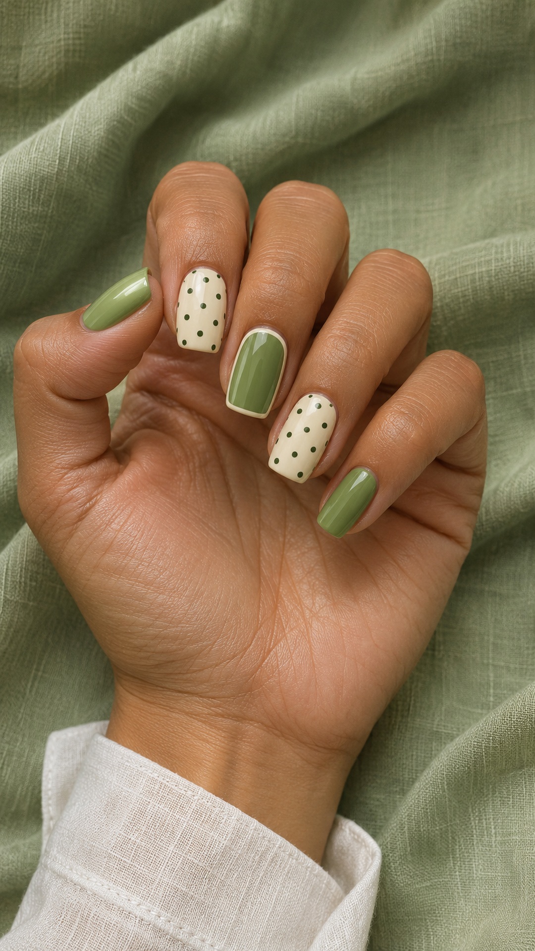
Pistachio and ivory feel soft together, but the darker green dots add definition. Alternating quiet green nails with patterned ivory ones creates a balanced rhythm without making every finger identical. The fine border is a supporting detail: it should connect the colors rather than become a second dominant pattern.
Make it yours: Choose the dark green against the actual ivory base before painting the dots. If the contrast looks weak, deepen the dots instead of making them larger.
4. Lilac and Tangerine
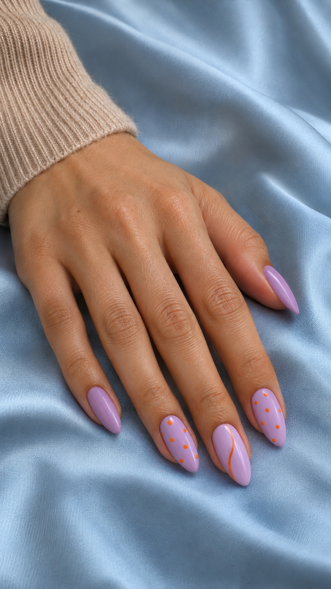
Tangerine adds a bright, unexpected note to lavender. The small dots and single curved line create two related gestures, while the repeated purple base keeps the set coherent. This combination works especially well when you want noticeable color with a relatively light amount of artwork.
Make it yours: Keep the orange details opaque so they do not disappear into the purple. Use the curved line on only one nail and leave generous lavender space around it.
5. Burgundy Swiss Dots
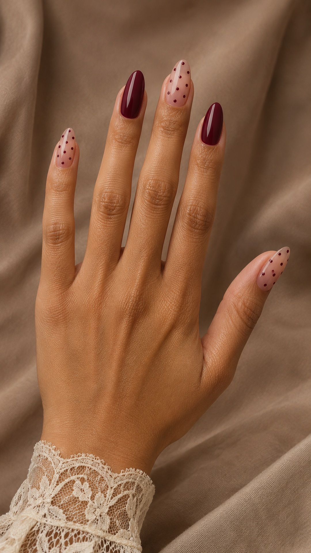
Burgundy dots give a sheer rosy base the look of a delicate printed fabric. The solid red accents make the set feel richer and prevent the small pattern from becoming overly sweet. A medium almond shape provides room for the dots, but the color relationship also translates well to shorter rounded nails.
Make it yours: Choose a burgundy that remains visibly red in ordinary indoor light. Ask for flat painted dots if you want a smooth surface rather than raised embellishments.
6. Cobalt Crescent Windows
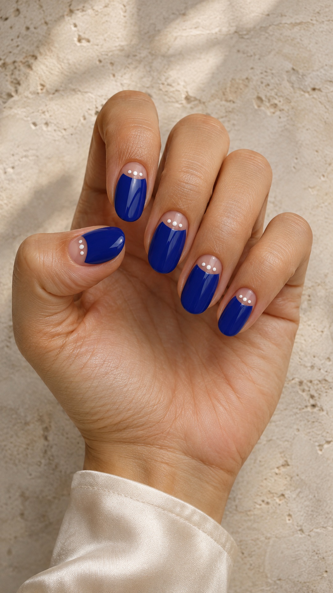
The nude crescent at the base of each cobalt nail creates a small window within a strong color. White dots placed inside that quieter space feel intentional and graphic. Because the blue occupies most of the nail, the manicure keeps its bold character even though the decoration is tiny.
Make it yours: Sketch the crescent placement first. Keep the dots away from the window edge so they remain separate marks rather than forming an uneven white line.
7. Blush and Charcoal
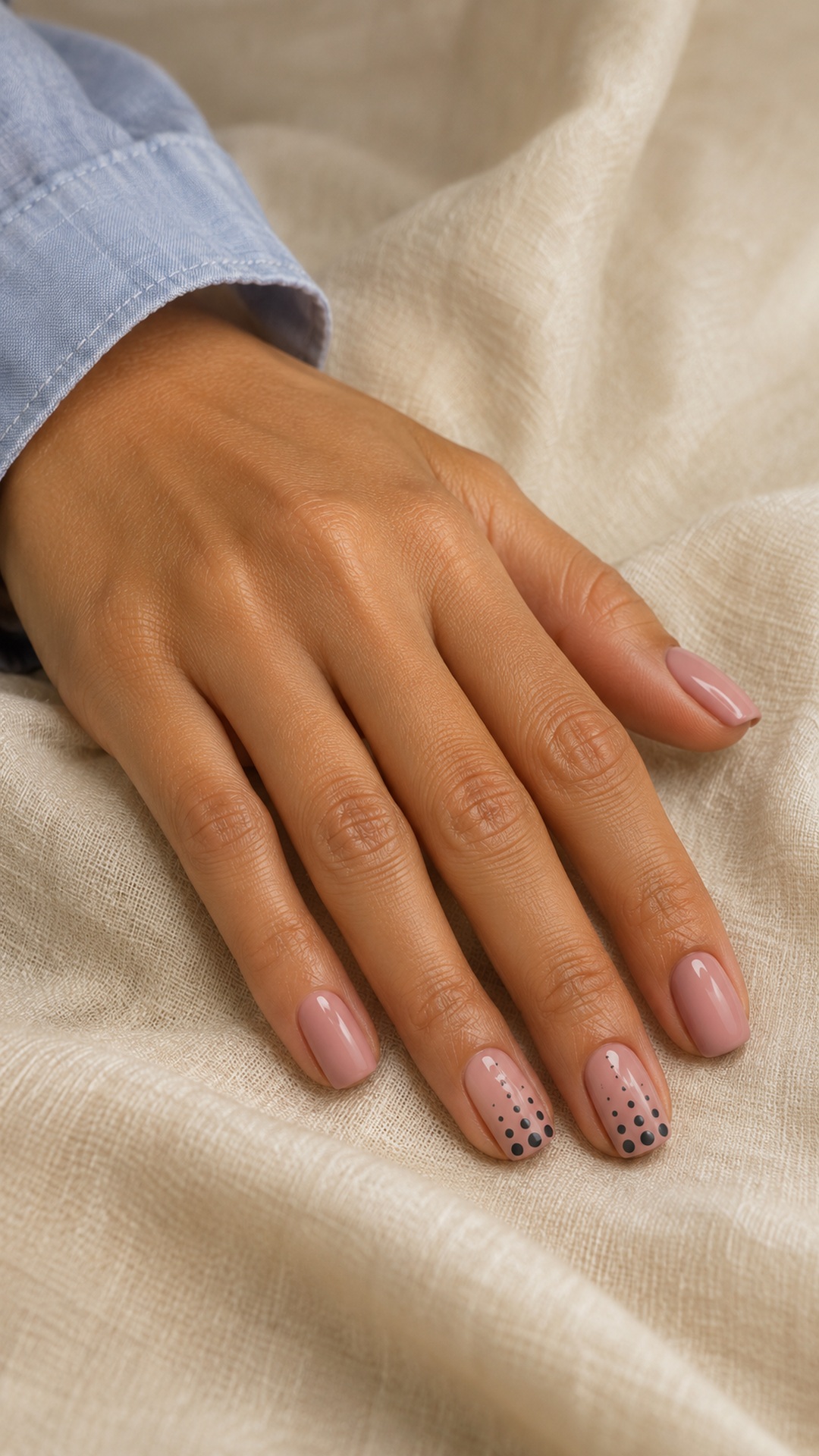
Charcoal gives dusty blush a sharper finish without the starkness of pure black. Graduating the dot size adds movement to the two accent nails, making the pattern feel designed rather than scattered. The short square shape keeps the effect compact and suits a more graphic interpretation of a pastel manicure.
Make it yours: Use only a few clearly different dot sizes. Too many tiny steps can look accidental, especially when the available nail surface is narrow.
8. Pearl Grey Confetti
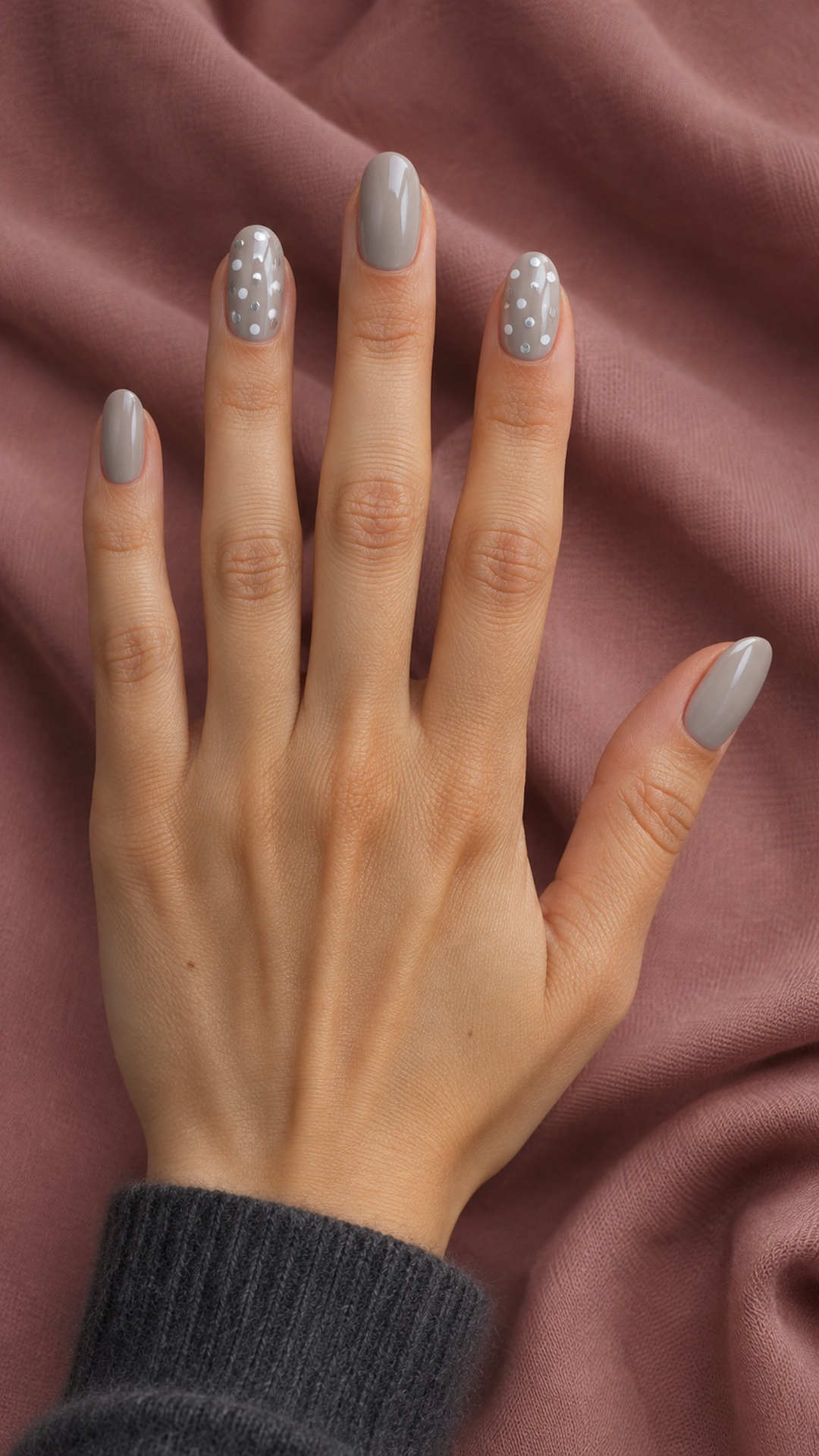
Pearl grey keeps this dotted design quiet, with white marks adding clarity and silver ones catching the light. The result sits between a print and a subtle decorative shimmer. Leaving several nails plain is useful here because the base itself already has a soft reflective quality.
Make it yours: Compare the white and silver dots on a sample. They should look deliberately different; if the metallic marks vanish, keep them slightly larger or use fewer white dots nearby.
9. Terracotta Dotted Borders
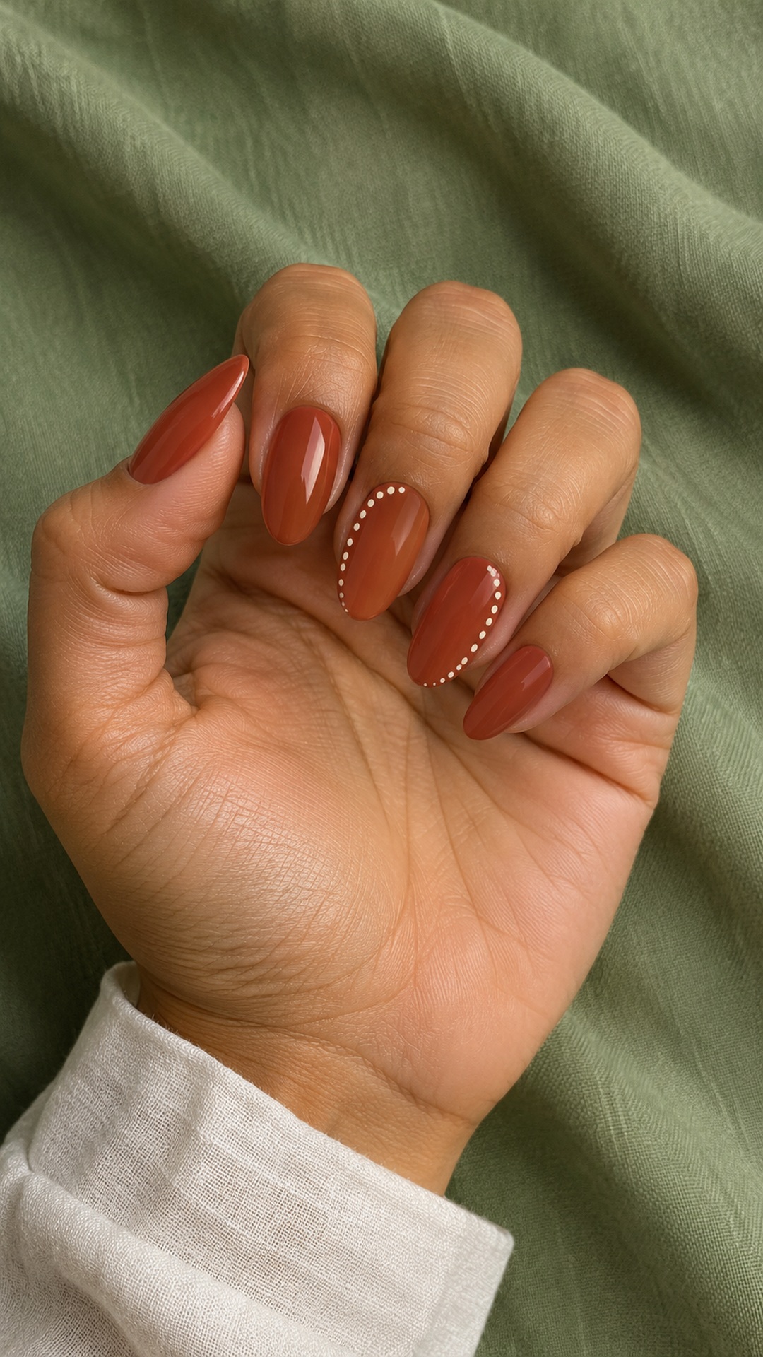
A dotted ivory border changes the direction of a terracotta manicure without taking over the whole nail. Following one side rather than outlining every edge creates a lighter, more fluid effect. The warm base and creamy marks work together as a restrained alternative to a high-contrast black-and-white print.
Make it yours: Decide which side the border follows before the set begins. On shorter nails, stop the dots before they crowd the cuticle area or curve around the entire tip.
10. Mint and Cocoa Tiles
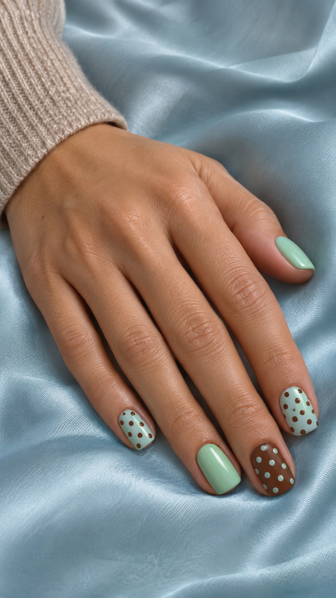
Mint and cocoa create a gentle contrast with enough depth to make the print stand out. Reversing the colors on one accent gives the set variety while retaining the same two-color palette. Plain mint nails help the repeated dots look like a deliberate accent rather than a continuous pattern across the whole hand.
Make it yours: Keep a similar dot size on the light and dark bases. The color reversal already supplies contrast, so the layout does not need another competing change.
11. Marigold Negative Space

A diagonal band of marigold dots lets the sheer base remain part of the design. The open space makes the pattern feel airy, while the solid yellow nails provide a clear color anchor. This is a good option when you prefer a graphic accent over an all-over print.
Make it yours: Mark the direction of the diagonal before adding individual dots. Leave clear space on both sides of the band so its shape is easy to recognize.
12. Berry Jelly Dots
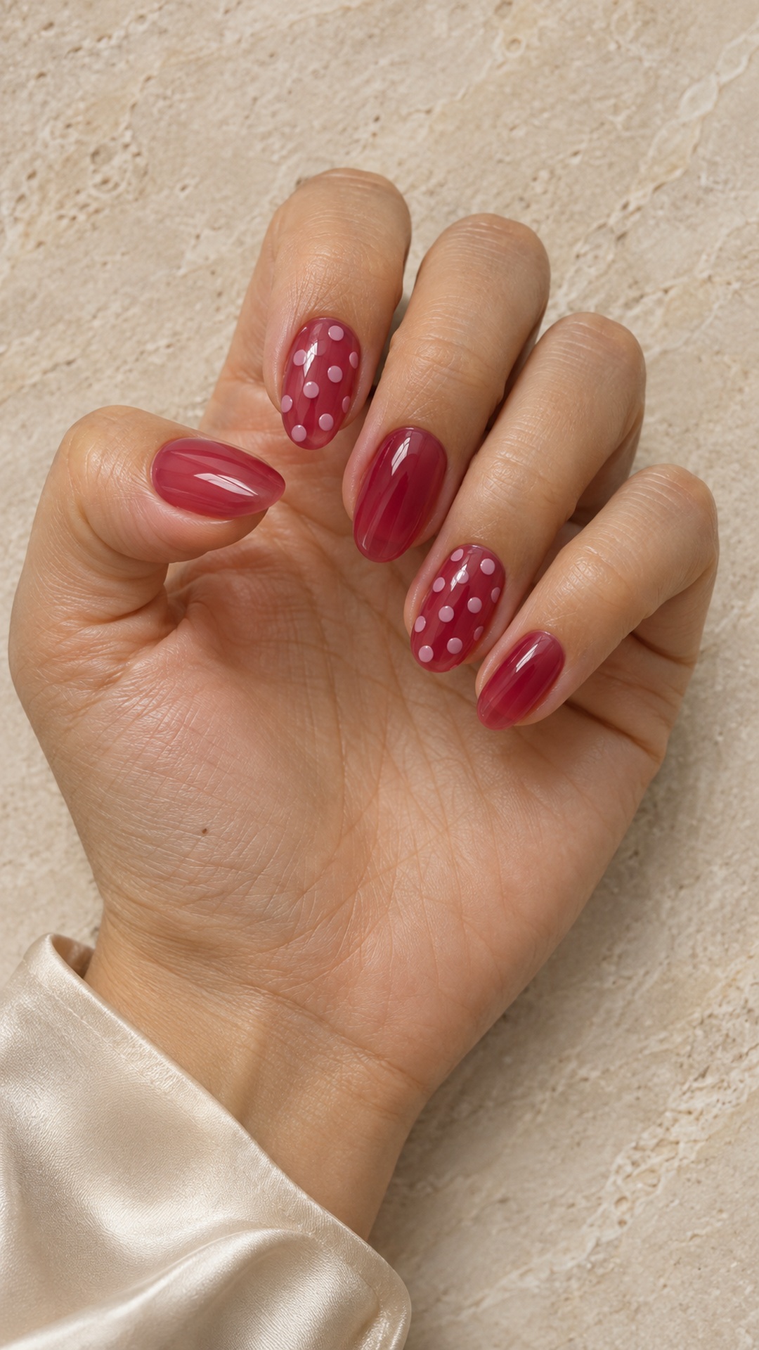
Raspberry jelly gives the nails a translucent depth that contrasts with opaque pale-pink dots. The two finishes are the point of the design: the base should look light-filled, and the dots should remain clearly defined. Keeping some nails free of decoration makes that difference easier to see.
Make it yours: Ask to view the raspberry color over the intended base. A very opaque result will change the effect, even if the shade itself looks similar.
13. Navy Satin Spots
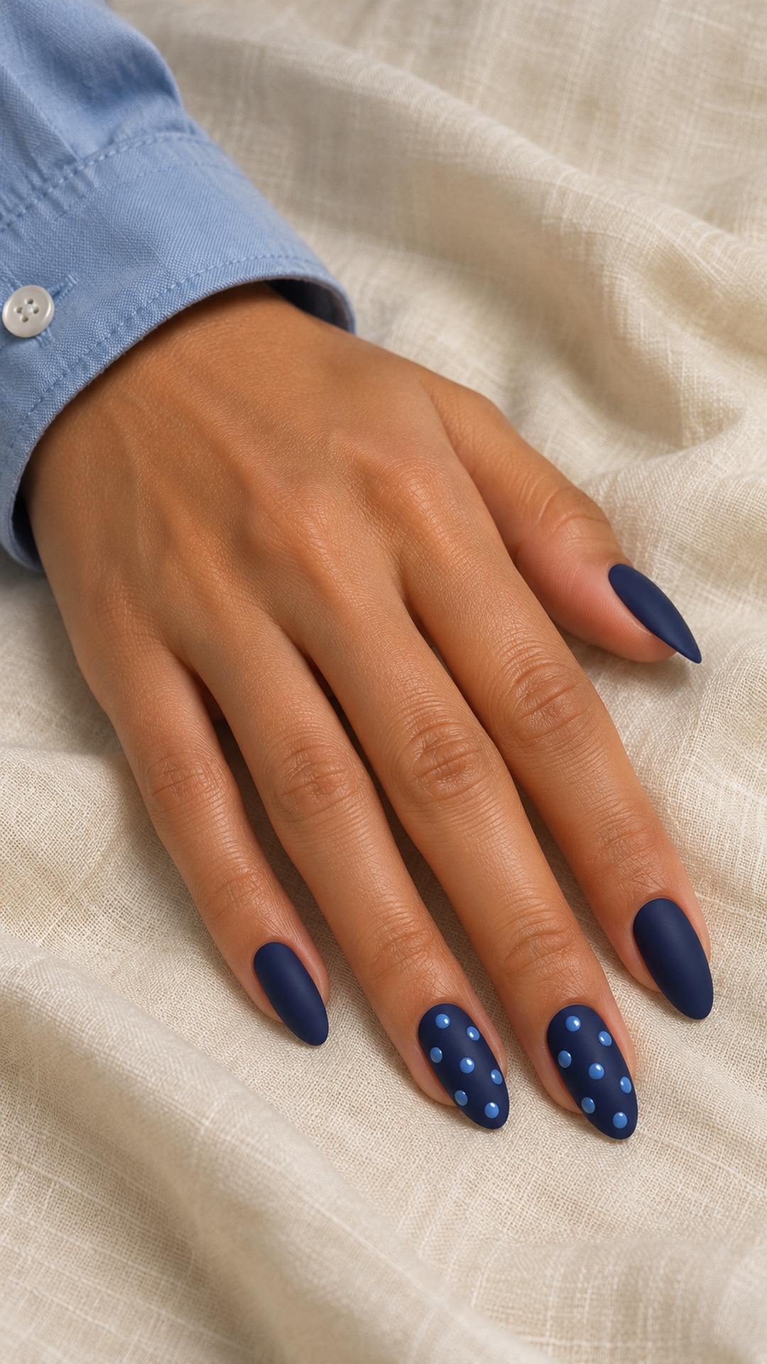
Matte navy and glossy blue dots make finish as important as color. From one angle the print looks quiet; from another the dots become more visible. This gives a familiar pattern a subtler character without relying on extra motifs, stones or metallic outlines.
Make it yours: Discuss how the matte background and glossy marks will be kept distinct. If you prefer one smooth glossy finish, retain the color contrast and skip the texture difference.
14. Peach Dot Ribbons

Coral dots and peach curves create a lively accent over ivory. The softer ribbon line connects the scattered circles, while the solid coral nails prevent the drawing from feeling disconnected from the rest of the hand. The result is expressive but still limited to a compact color palette.
Make it yours: Keep the curves thinner than the main dots. If both marks have equal visual weight, the accent can start to look crowded on a short nail.
15. Teal and Champagne
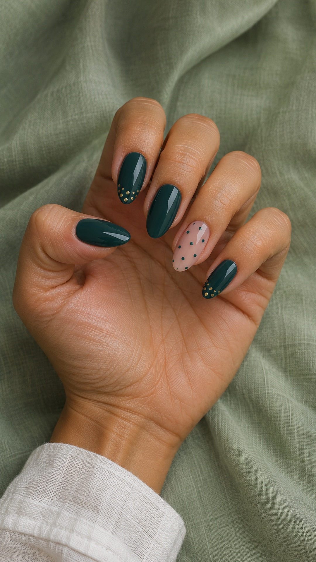
Champagne dots bring a small amount of light to deep teal. A nude accent with teal marks repeats the palette in reverse and gives the darker nails a softer companion. The metallic detail should feel like a finishing touch rather than an additional full-coverage glitter layer.
Make it yours: Choose fine, flat metallic dots and leave space around them. On a shorter shape, keep the gold near the edge and simplify the nude accent to a few teal marks.
16. Lavender Dot Halos
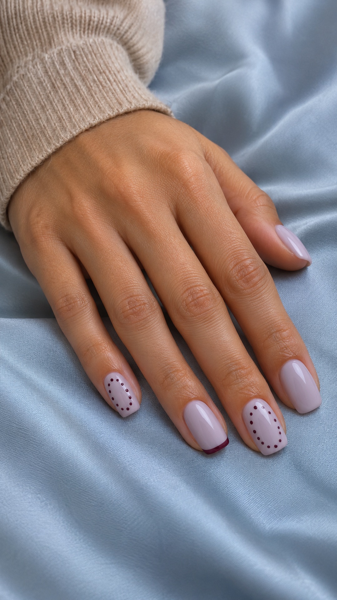
Plum dots arranged as loose halos give milky lavender a decorative shape without filling the center. A fine French edge repeats the darker color in a simpler form. This combination suits someone who likes a coordinated manicure but wants the accent nails to differ from the plain ones.
Make it yours: Treat the halo as a suggestion rather than a rigid perfect oval. Leave the center open, and avoid adding a second ring of dots on a smaller nail.
A mini-guide to cleaner dotted nail art
Plan the spacing before the size
A small number of well-separated dots often looks clearer than a large number of tightly packed ones. Start by deciding where the first few marks belong, then fill the gaps gradually. Keep some distance from the sidewalls and cuticle so the pattern has a visible boundary.
Practice with the actual polish
Different formulas spread differently. Try the base and dot color on a practice tip, using the tool you intend to use on the nails. A dotting tool can help with a consistent round mark, but the amount of polish and pressure still matter. Refresh the polish on the tool when the dots begin to shrink or lose their shape.
Use a simple sequence
For regular polish, prepare and apply your chosen base according to its directions, let it set sufficiently before adding the pattern, then place the dots with a light, controlled touch. Allow the artwork to dry as directed before finishing. Gel systems require their own compatible products and curing instructions; do not use a regular-polish timing assumption for gel.
Keep the set balanced
If two nails have a dense pattern, make the others quieter. If you reverse the colors on one nail, retain a similar dot size so the relationship stays obvious. Photograph a practice tip at normal hand-viewing distance: a layout that looks appealing close up may feel too crowded when viewed as part of the whole hand.
Adapt instead of shrinking everything
When converting a long-nail reference to a shorter shape, keep the main color relationship and remove some secondary marks. A large dot can still work on a short nail if it has enough space around it. The aim is a readable pattern, not a miniature copy of every detail.
Frequently asked questions
Which polka dot nail ideas work on short nails?
Try two patterned accents with plain coordinating nails, a single dotted crescent or a small diagonal band. Reduce the number of marks before reducing every dot to a tiny size.
Do all the dots need to be identical?
Not always. An even repeat feels graphic, while a planned change in size adds movement. Choose one approach clearly so variation looks intentional rather than accidental.
Can polka dots work with a French manicure?
Yes. Keep the dots inside the tip or use one dotted accent beside plain French edges. Match at least one color between the two treatments.
How can I make a dotted manicure look more understated?
Use related shades, keep most nails plain and choose smaller areas of pattern. A tonal base and dot color will usually look quieter than black against bright white.
Are these photographs of salon clients?
No. These are original AI-created Youlolo design concepts. They illustrate color and layout ideas; a nail artist can advise on the practical version for your nails.
For another editorial perspective on the theme, visit BeautyCoded’s polka-dot nail collection. The concepts, illustrations and practical notes in this article were created independently for Youlolo.
[…] a related approach to small repeated marks, explore our polka-dot nail ideas. If you enjoy garden-inspired accents with a different subject, browse these fruit nail designs […]