The Best Fluffy Pancakes recipe you will fall in love with. Full of tips and tricks to help you make the best pancakes.


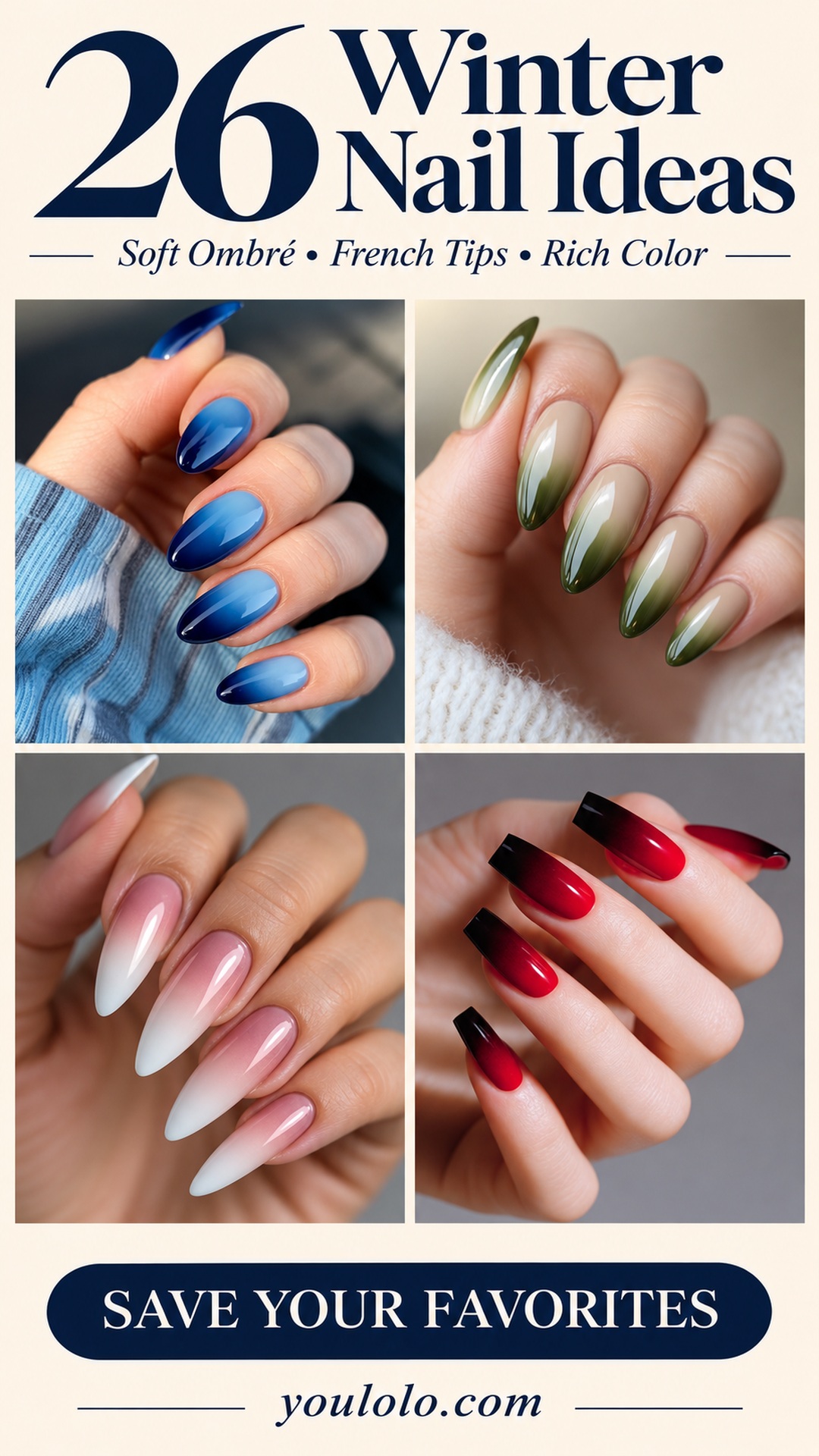
When I save a winter manicure, I am usually looking for a feeling first: something rich against a knitted sleeve, something softly luminous on a gray day, or a clean white tip that makes even a simple outfit feel finished. This collection brings those moods together through color, shape, and finish rather than relying on holiday artwork.
These 26 winter nail ideas move from plum, rose, and blue gradients into earthy greens, soft pink-and-white designs, and a few darker accents. Most have a smooth, uncomplicated surface, but small choices make them surprisingly different. A blurred tip feels softer than a crisp French line. Matte gray has a quieter character than glossy navy. And a square edge can make a familiar pink-and-white palette feel much bolder.
I have kept similar designs together where the comparison is useful, and I have pointed out the details I would preserve if I brought each photograph to an appointment. You do not need the exact length to enjoy the idea. Start with the color placement you love, then decide how much contrast, shine, and shape suits your own routine. Each reference photo has its source pin linked underneath so you can return to the image that caught your eye.
1. Glossy Plum with a Softer Lavender Glow
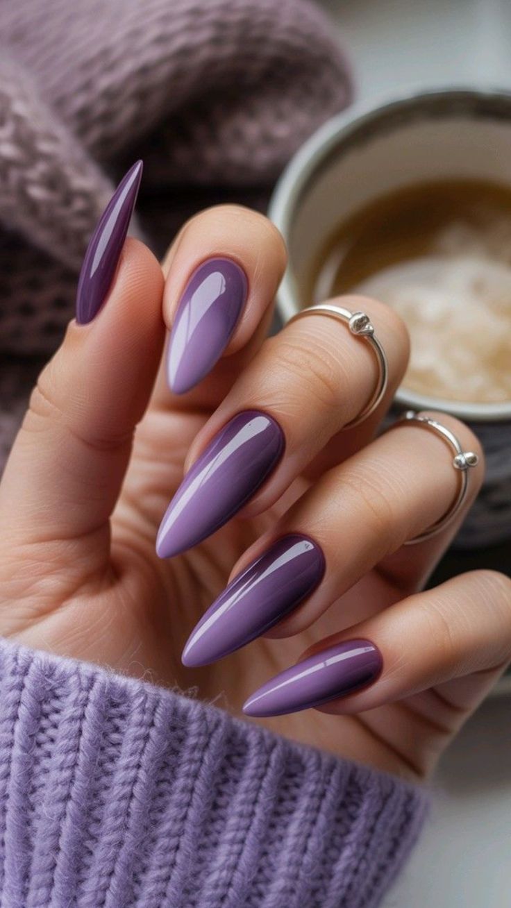
This is the sort of purple I would choose when I want something rich without going all the way to black. The long, tapered shape makes the color feel sleek, while the lighter lavender areas keep it from looking flat. Against that knitted cuff, the shine becomes the prettiest contrast: soft fabric, smooth nails, and just enough drama.
I would keep the styling simple and let the color do the talking. If you bring this reference to an appointment, point out both the deep edges and the lighter-looking center. A single opaque plum shade will give a different result. The photograph alone does not establish which product created the effect, so discuss the finish as well as the color.
2. Muted Orchid on a Long Tapered Shape

There is something lovely about a purple that feels a little dusty. This orchid shade has enough pink in it to feel soft, but the length gives it presence. I like that the manicure does not depend on a separate accent nail. Repeating the same color lets you appreciate the silhouette and the neat curve around each cuticle.
For my own version, I would keep the narrow tips and choose the length around my daily routine. On a shorter almond, the shade would still carry the mood beautifully. Ask to see the color in ordinary daylight if possible; a mauve that looks balanced in one photograph may read much pinker or cooler in another setting.
3. Pink and Lavender Sorbet Ombré

This blend feels airy, almost like two pastel shades melting together. The pale lavender near the base gives way to a brighter pink toward the tips, and the long almond shape leaves room for the transition. I love it with the casual denim in the reference. The combination makes a polished manicure feel easy rather than overly dressed up.
The detail I would protect is the softness between the colors. A visible stripe would change the whole character of this set. You can keep the same idea on medium-length nails by using two shades that sit closer together. I would skip extra glitter here; the gradual shift already gives your eye somewhere to travel.
4. Milky Nails with Blue and Violet Edges
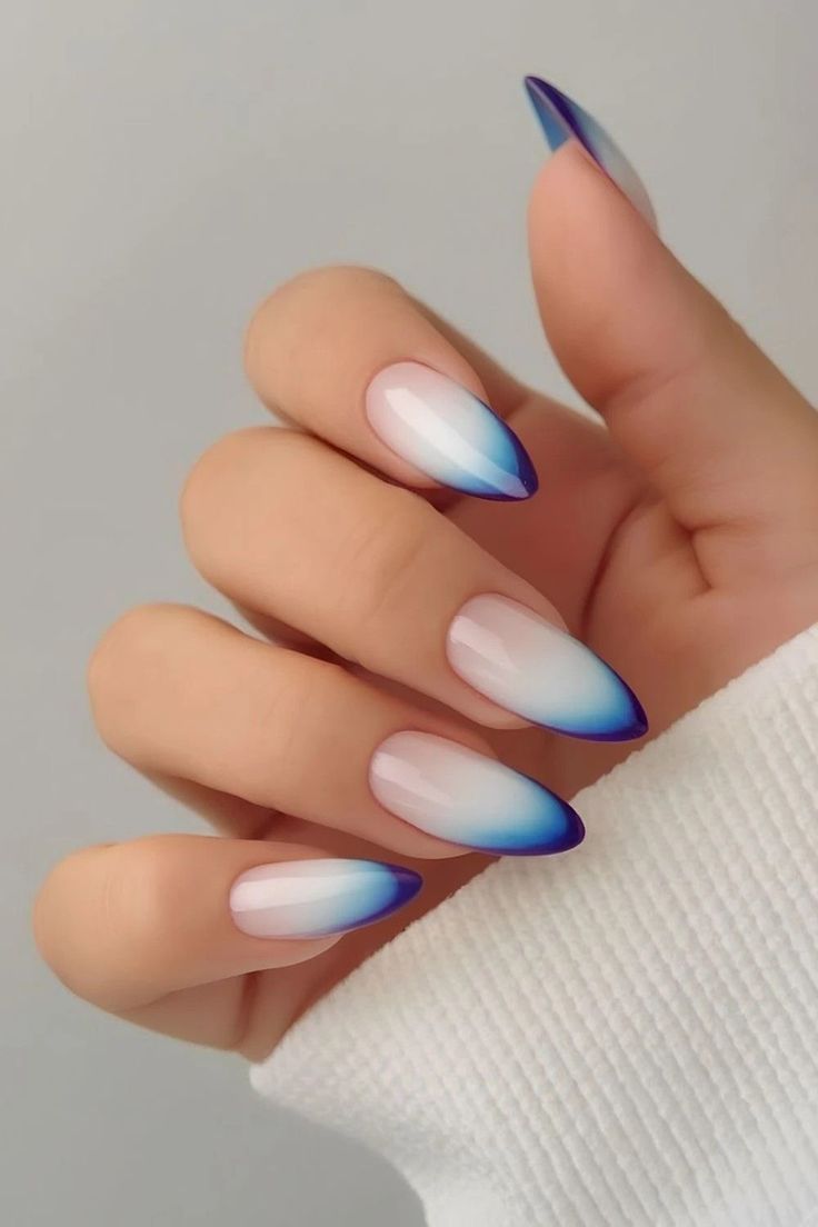
The pale centers are what make this manicure so striking. Instead of covering each nail in dark color, the blue and violet gather toward the pointed edges, almost framing the milky base. It feels crisp and slightly futuristic, but the soft white keeps it wearable. This is one of my favorites for someone who wants color without a full dark set.
I would show the photograph rather than asking for a standard blue French tip. The border looks softened and shaded, not like one clean block of color. Keep enough pale space through the center so the effect can breathe. A shorter almond could work too, with a narrower sweep of blue around the free edge.
5. Soft Pink into Milky White

Sometimes the quietest manicure is the one I keep coming back to. This pink-to-white fade has no sharp smile line, just a gentle lightening toward the tip. The result feels clean and delicate, especially on the rounded almond shape. I like the way the white stays soft rather than becoming a bright, chalky block.
This would be my starting point if I wanted something that works with several outfits and occasions. Ask for a translucent-looking pink that suits the effect you want, then decide how white the tips should be. More contrast gives a stronger ombré; a softer white keeps the whole manicure subtle. The finish matters as much as the palette.
6. Burnished Brick Red with a Glossy Finish

This warm red is a welcome pause between the cooler colors. It has a brick or cinnamon quality that feels especially good beside cream knitwear. The manicure is simple, but the almond outline and bright reflections give it polish. I would choose this when I want a noticeable color without committing to painted details.
The reference reads mostly as a solid shade, so I would not ask for an elaborate gradient to recreate its appeal. Bring attention to the warmth of the red instead: too much berry will make it cooler, while a more orange base will take it toward terracotta. A glossy finish is the finishing touch I would keep.
For more playful holiday details, our cute Christmas nail ideas offer more ways to make playful artwork the focus of your manicure.
7. Lavender Melting into Deep Berry

Here, the contrast is the whole story. Pale lavender at the base gradually deepens into a dark berry tip, giving the nails a moody finish without losing their softness. The broader soft-square shape makes the fade feel generous and smooth. I especially like how the deepest color sits at the ends, where it quietly emphasizes the outline.
I would choose this over a single dark purple when I wanted more dimension. The transition needs enough space, so on shorter nails I would bring the shades a little closer together. Keep the darkest section controlled rather than letting it swallow the lavender. That balance is what makes the reference feel luminous instead of heavy.
8. Electric Violet with Dark Roots
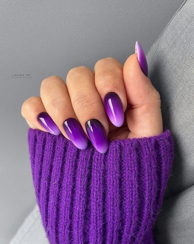
This violet has a brighter personality than the muted purples earlier in the collection. The darker area near the base and the vivid color toward the tips give it a lit-from-within appearance. Paired with the matching purple sleeve, it feels wonderfully confident. I like a monochrome moment when there is enough variation in texture to keep it interesting.
My version would keep the nails glossy and leave out additional decoration. The color already has plenty of energy. If you prefer a quieter result, ask for a less saturated violet while keeping the same dark-to-bright direction. It is the placement of the shades, not just the word purple, that makes this reference distinctive.
9. Sky Blue Fading into Midnight

Blue looks particularly elegant when it moves from a clear, lighter shade into navy. In this reference, the light area near the cuticle gives the darker tips a little breathing room. The effect feels cool and smooth, with a lovely contrast against the blue knit. I would happily wear this through the colder months without adding a single snowflake.
For the closest mood, keep the dark tips blue rather than black. A very black edge would create a harder contrast. I would also keep the blend continuous across every nail, so the set reads as one idea. On a shorter length, a medium blue and navy pairing can preserve the effect without needing such a long transition.
For a cooler palette that can carry beyond Christmas, take a look at our icy blue winter nail ideas, with softer snowy details and frosty color combinations.
10. Rose Pink into Wine Red

This is a romantic take on a dark manicure. The pink near the base keeps the wine-colored tips from feeling too severe, and the glossy finish brings the two shades together. I like that it has the richness of burgundy without covering the entire nail in it. It would look beautiful beside a pale sweater or a simple black sleeve.
I would ask for a gradual rose-to-wine fade with the darkest color concentrated at the tip. Keeping a little brightness in the middle is important here. If you want a softer version, use a muted rose and berry rather than a near-black wine. The same placement can feel quite different depending on the depth of those final few millimeters.
11. Matte Gray Fading into Charcoal

The matte finish changes everything in this set. Pale gray moves into charcoal with a soft, smoky quality, and there are no glossy reflections competing with the blend. It feels restrained and a little architectural. I love it with the gray knit and simple silver ring because the whole look stays within a quiet, cool palette.
This is the reference I would choose if I liked dark nails but wanted a gentler surface. Ask for a smooth gray gradient first, then discuss the matte finish separately. A glossy version would still be pretty, but it would not have this velvety appearance. Keep the silhouette neat; the simple design makes the outline especially noticeable.
12. Nude Bases with Inky Blue Tips

There is a little more open space in this blue design than in the sky-to-navy set. The base stays close to a natural nude, while the deep blue gathers at the ends. That contrast makes the nails feel light and dark at the same time. I like the way the softened border avoids the strict outline of a traditional French manicure.
To recreate the mood, I would ask for a nude base with a diffused navy tip rather than a fully blue ombré. Keep the blue rich enough to be visible, but leave the cuticle area quiet. This would be a lovely option when you want to try a deep shade in a smaller dose.
13. Creamy Olive with Deep Green Tips

This olive blend is one of the most understated colors in the group. The creamy base brings warmth, while the dark green at the ends gives the manicure definition. I love that it feels earthy rather than jewel-toned. Against the pale sweater, the green looks particularly rich without needing gold foil or any seasonal artwork.
I would keep the beige slightly warm and choose an olive that stays clearly green in daylight. The long almond shape lets the fade stretch out, but the palette could also look lovely on a medium oval. For me, the essential detail is the gentle passage through lighter green before the deeper tip, rather than an abrupt color change.
14. Sheer Nude into Warm Coral Red
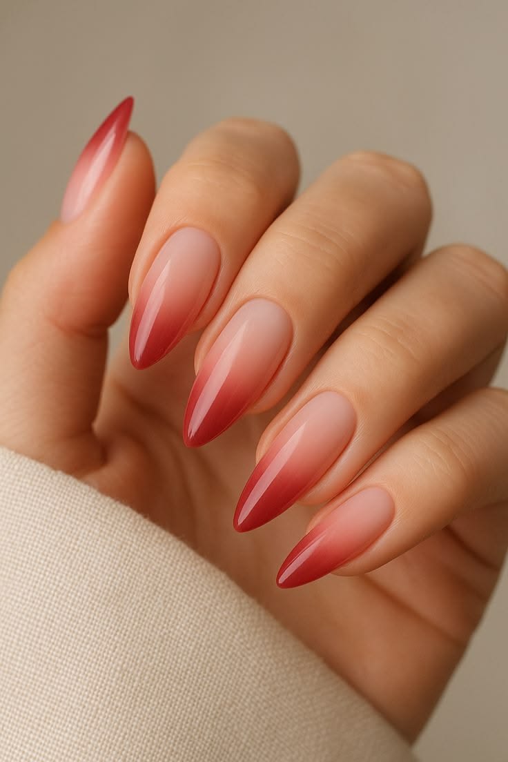
This red feels lighter and warmer than the wine gradient. The nude base gives the color room to build, so the tips become the focal point without making the entire set look dense. I like its clean, uncomplicated feel. It brings a little brightness to neutral clothes while still leaving plenty of soft space on each nail.
I would show the reference if I wanted a warm red fade, because asking for red ombré alone could lead to a much darker result. A peachier nude will emphasize the warmth; a cooler pink base will shift the mood. Keep the red concentrated toward the ends so the translucent-looking beginning remains part of the design.
15. Seafoam and Cream with a Glassy Shine

This seafoam palette feels fresh beside all the darker shades. Some nails read more green, while the pale areas soften the set and give it a creamy quality. The strong shine makes the colors look smooth and fluid. I would choose this for a winter manicure when I wanted something light but did not feel like wearing white or pink.
The charm is in the limited palette, so I would resist adding another accent color. Decide how much green you want before the appointment: a mostly creamy set will feel delicate, while more seafoam will make a stronger statement. The reference gives you a useful middle ground, with enough variation to keep the repeated shape interesting.
16. Emerald Framing a Soft Nude Center
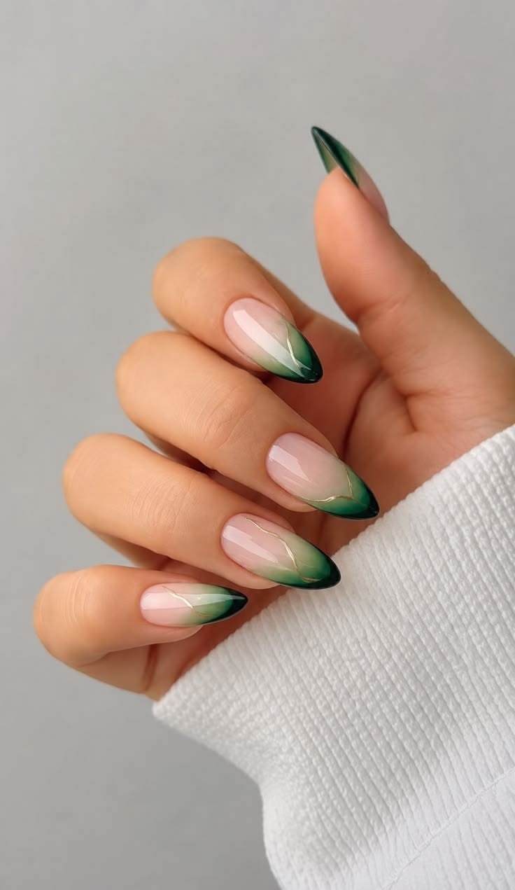
The green in this design follows the edges more clearly, creating a curved frame around the nude center. It has the elegance of French tips with a little extra depth. I like how the visible base keeps the dark green from dominating. The tucked-in hand pose and pale sleeve make the sharp shape feel softer in the photograph.
I would keep the green placement deliberate rather than blending it across the whole nail. Ask your nail artist to balance the colored edges with the amount of nude you want to show. On a shorter shape, narrowing those edges would help preserve the open center. This is a good reference for someone who likes color and negative space together.
17. Blush Pink with Rose-Tinted Points

This rose gradient feels feminine without relying on floral details. The pale pink starts softly, then becomes deeper toward the points, giving the long nails a graceful outline. I like the glossy finish and the way the color stays within one family. It is a quieter alternative to the high-contrast wine or navy gradients.
I would choose this when I wanted length to be the main statement. Keep the shades close enough that the transition feels seamless, and let the tip become only a few steps darker. If the pointed shape feels too dramatic for you, a rounded almond would keep the same romantic quality with a softer ending.
18. Pearl-Like Pink and White Ombré
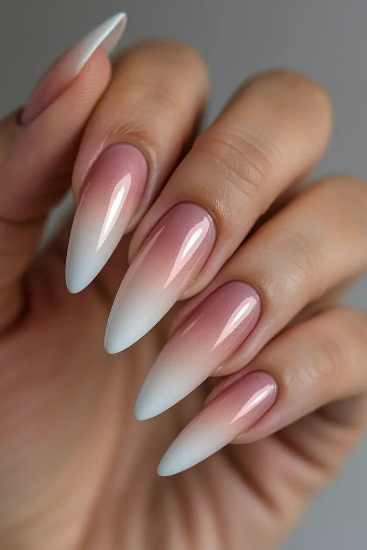
The delicate sheen is what draws me to this pink-and-white set. There is a fine luminosity through the rosy base, while the white tips stay soft and opaque. The longer almond shape gives the fade plenty of room. I would save this for a polished, dressed-up look that does not need large crystals or obvious glitter.
I would describe the finish as softly luminous and use the photograph to discuss it, rather than assuming a particular chrome powder was used. Too much metallic shine could overpower the gentle blend. Keep the white transition smooth and the pink visible near the base; both parts are needed for that airy, balanced effect.
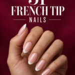
19. A Delicate White French on Almond Nails
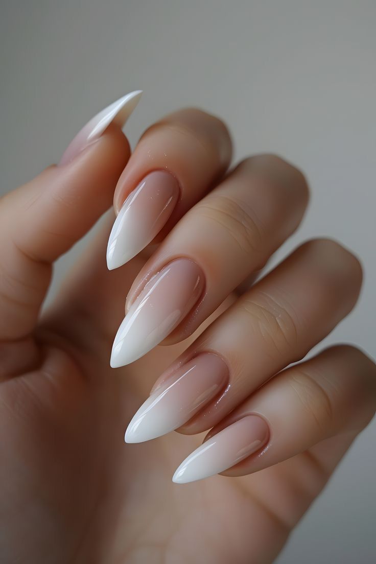
This set moves back toward a more defined French tip. The nude center remains visible, and the white follows the almond shape in a clean curve. Compared with the full pink-to-white fade, it feels more precise. I like the simplicity here: the shape, the border, and the gloss all get an equal share of attention.
For my own version, I would keep the white proportionate to the nail length. A very wide tip would create a bolder manicure, while a slimmer curve would feel delicate. Bring this reference when you want an almond French with a clear white edge, and explain whether you prefer the base to look sheer or more covered.
20. Long Square French with Soft Pink Bases
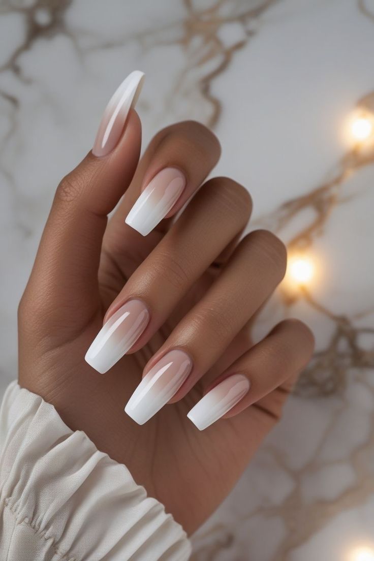
A square tip changes the personality of a pink-and-white manicure immediately. These longer nails have a stronger outline than the almond versions, and the bright white ends emphasize that shape. I like the contrast between the straight free edge and the softness of the pink base. It feels polished with a little more attitude.
The width of the white matters here, so I would decide whether I wanted a bold French band or a thinner one before choosing the final length. Keep the corners and sidewalls visually consistent across the set. If you love the palette but not the length, a shorter square can still retain its clean, graphic character.
21. Cherry Red Fading into Black
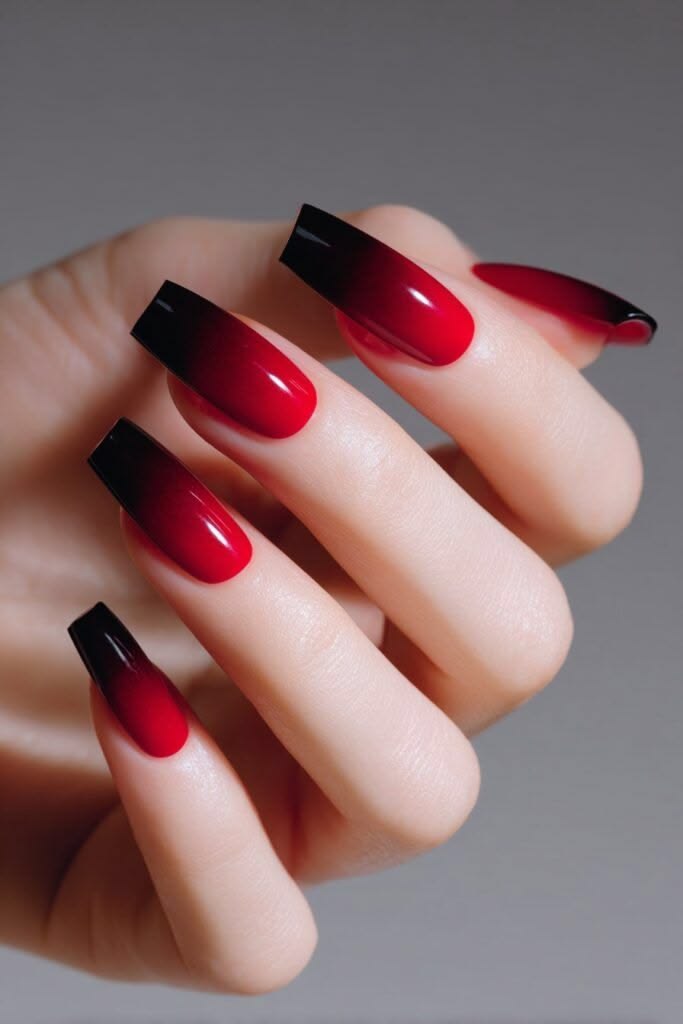
This is the most dramatic gradient in the collection. Bright red at the base deepens into black at the squared ends, making the color transition impossible to miss. I love that the design stays otherwise simple. There is no extra artwork competing with the red, and the straight tips give the manicure a confident finish.
I would keep a generous area of clear red near the base so the black does not take over. The blend between them should feel gradual, with a deep wine stage in the middle. If the square shape is not your preference, the same colors on an almond would soften the outline while keeping the dark, striking mood.
22. Matte Nude and White Winter Contrast

This set uses white in more than one way: some nails are fully pale, while others keep a nude center with a white tip. The matte-looking finish ties the different placements together. I like that it feels wintry without using literal holiday symbols. The small variation makes it more interesting than a completely identical French set.
I would keep the nude shade consistent across the nails and use the same white throughout. That simple repetition helps the mixed layout feel intentional. If you prefer gloss, you can borrow the arrangement, but the matte surface is a big part of the reference’s softness. Decide which quality matters most to you before adapting it.
23. Shorter Square Nails with a Soft White Fade
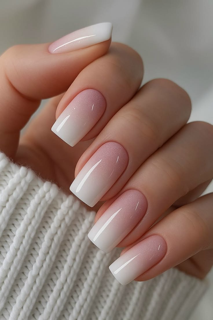
This is the version I would save for someone who loves a soft white manicure but wants less length. The square ends give the nails a tidy outline, while the gradual fade keeps the color gentle. There is enough pink visible to make the white feel light rather than solid. It is a lovely example of a simple idea scaled down.
The main detail to discuss is how early the white begins. If it starts too close to the cuticle, the result can look mostly white; if it stays only at the edge, it becomes closer to a French tip. I would keep a little transition space in the middle, even on a shorter nail.
24. Black Smoke over a Sheer Nude Base
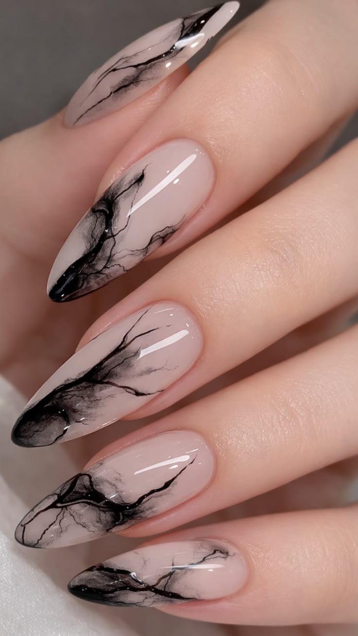
These fine black wisps are such a beautiful change of pace. The nude base leaves room around the darker areas, so the pattern feels like drifting smoke or delicate stone veining. I like the irregularity: each nail belongs to the same set without needing an identical mark. The darkest sections gather toward the tips and create a loose visual rhythm.
I would ask for light, airy veining with a few concentrated black areas rather than a dense marble pattern. Too many lines would take away the negative space that makes this reference so elegant. There is no need to copy every branch of the pattern; preserving the balance between clear space and dark detail matters more.
25. Charcoal Glitter with a Silver Accent
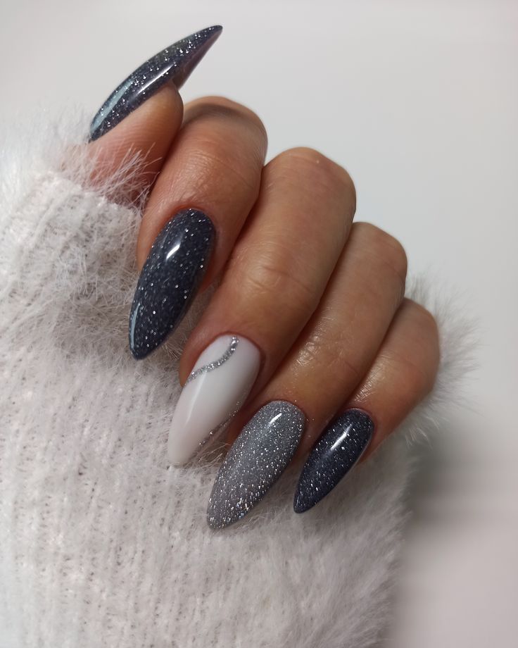
This is the evening option I would keep in the collection. Dark charcoal sparkle sits beside a brighter silver accent, while the white nail gives the eye a quiet place to rest. The fine silver curve on that pale nail connects it to the glitter without covering it completely. I like that there is both shimmer and restraint in the layout.
I would keep the glitter tones cool and choose the accent placement deliberately. Repeating a little silver on the white nail makes the whole set feel related. If you want less sparkle, borrow the white accent and use plain charcoal on the surrounding nails. The contrast will remain, even when the finish becomes calmer.
26. Extra-Long Pink and White Pointed French

This final set takes the familiar French palette and lets the length do something bold. The nude pink base stretches into long white points, creating a much sharper silhouette than the shorter square version. I like it as a statement manicure because the colors remain so clean. The shape gets all the attention without needing another decorative element.
For this reference, I would discuss the silhouette before the shade. The length, taper, and depth of the white tip are what distinguish it from a standard French manicure. You can shorten it substantially and still keep the idea, but the result will feel less dramatic. Choose the version you will enjoy wearing, not only photographing.
How I Would Narrow Down My Favorites
I would start with three choices: a color family, a shape, and a finish. If I wanted something quiet, I would keep the pink-and-white fade or the shorter square version. For deeper color, the navy and olive gradients offer a softer starting point than a fully dark set. The red-to-black square nails would be my boldest choice, while the smoky veining would suit a day when I wanted a little more detail.
Then I would decide what makes the reference worth saving. Sometimes it is the exact shade; sometimes it is the amount of nude left visible, the softened border, or the matte surface. Pick that one detail to protect when adapting the design. It is easier to create a manicure you love when you know which part of the photograph matters most to you.
Frequently Asked Questions
What is the difference between ombré nails and French tips?
Ombré blends one color gradually into another, while a French manicure places a distinct color at the tip, usually with a visible border. Some designs sit between the two, with a nude base and a softly diffused colored edge. Show your nail artist the reference and point out whether you want a clear line or a blended transition.
Which of these winter designs can work on shorter nails?
The pink-to-white fade, plain brick red, and shorter square white gradient are useful starting points. Navy, olive, or gray blends can also be scaled down. On less length, choosing colors closer together can make the transition easier to read without requiring a large dark tip.
Do winter nails need snowflakes or Christmas artwork?
No. A winter mood can come from color and texture alone: deep plum, navy, charcoal, milky white, or a little silver sparkle. The designs here lean on those elements, which makes many of them easy to keep wearing after the holiday season.
Should I choose a matte or glossy finish?
Choose the surface that suits the effect you want. Gloss emphasizes reflections and gives gradients a glassy appearance; matte makes the color look quieter and more velvety, as in the gray-to-charcoal reference. Ask to see the finish over a similar shade because it can change how the color reads.
Can I tell which products were used from a Pinterest photograph?
Not reliably. A photo can show the visible color placement, shape, and apparent finish, but it does not confirm the polish brand, product system, or technique. Bring the image as a visual brief and ask your nail artist how they would create a similar result with the products they use.
What should I ask for when bringing one of these references to an appointment?
Name the details you want to keep: the shape, approximate length, base color, tip color, and whether the border is blended or crisp. Mention your preferred finish and any accent nails. For a smoky or marbled design, explain the balance of clear space and dark pattern you like rather than requesting every tiny line in exactly the same place.