The Best Fluffy Pancakes recipe you will fall in love with. Full of tips and tricks to help you make the best pancakes.


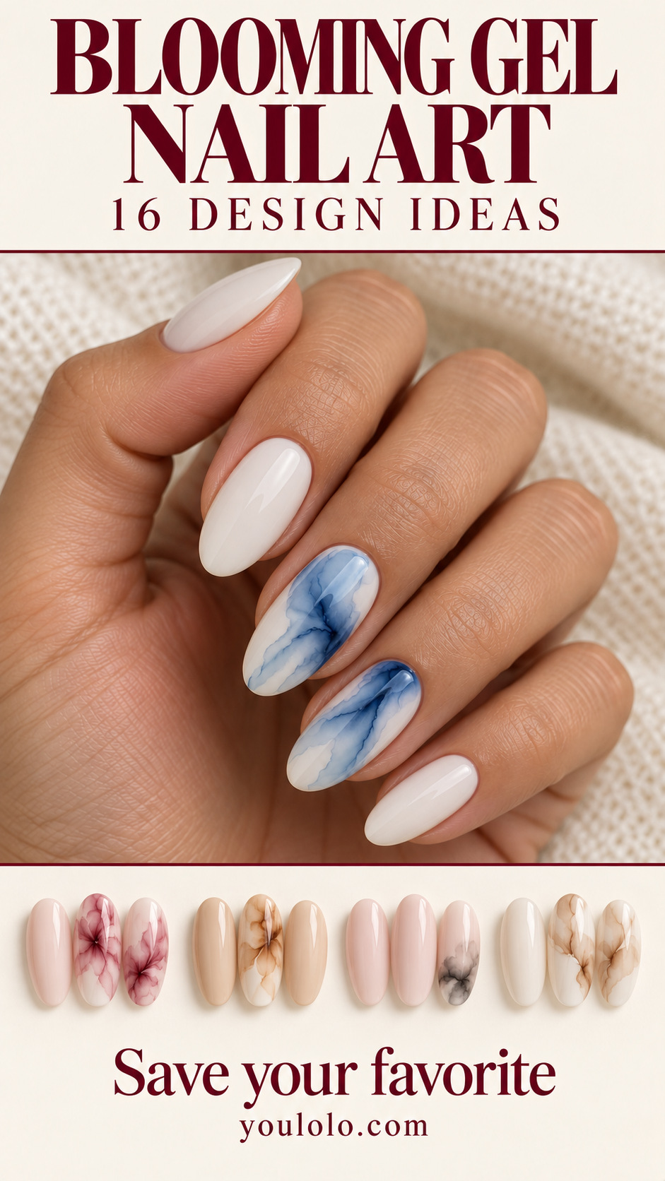
Blooming gel nail art is about soft boundaries. A dark color can drift through a pale base, a petal can spread into a halo, and a thin mark can become a loose vein. The appeal is the transition between colors rather than a sharply outlined drawing.
This edit has 16 separate palettes and compositions, including amber smoke, blue tide marble and sage-lilac pooling. Use it to decide what you want the flowing effect to resemble: a stone, a cloud, an abstract cell or a soft botanical gesture.
These are concept references for a professional conversation, not product demonstrations. The finished spread depends on the materials and technique. I would save the palette and the amount of open base around the pattern, then let the artist adapt the exact diffusion.
Visual note: these original AI-generated manicure concepts are inspiration images, not salon photographs or product tests. Ask your artist to adapt the design, shape and materials.
What Makes a Blooming Effect Different?
The GelBottle’s Blooming Gel instructions describe adding color while the blooming layer remains uncured, allowing it to disperse. Follow the specific manufacturer’s product system and curing instructions rather than treating one timing as universal.
A blooming effect creates softened edges; a hand-painted line keeps a defined boundary. The images below are visual interpretations of the softer direction. They do not prove which bottle, brush or lamp was used.
For a more stone-focused reference, compare our jade nails. The blooming edit includes stone-like effects, but also petals, clouds and abstract pooling.
| Effect | Reference to compare | Keep visible |
|---|---|---|
| Stone-like | Blue Tide Marble | Pale space around veins |
| Petal-like | Lavender Petal Drift | Separate softly spreading marks |
| Smoky | Amber Smoke | Light and deep areas |
| Abstract cells | Wine Abstract Cells | Distinct pools of color |
16 Blooming Gel Nail Art Looks to Compare
1. Rose Ink Bloom
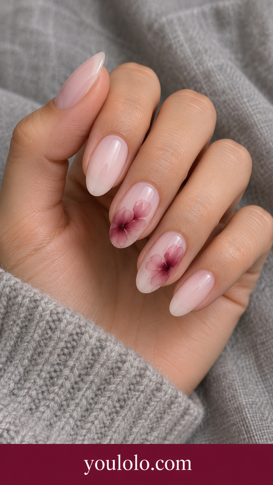
A burgundy bloom on blush looks like a little drop of ink spreading through pale paper. I would keep two accents and let the rest remain milky. Show your artist the soft perimeter: the fading edge is the essential detail, not a sharply drawn burgundy circle.
2. Blue Tide Marble
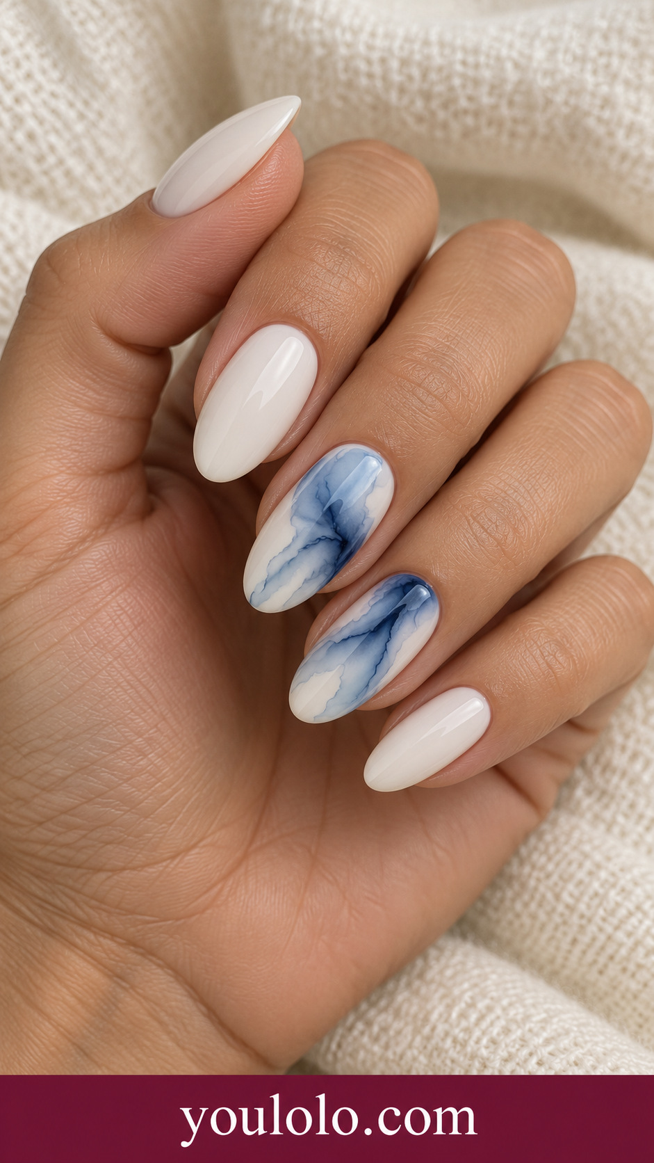
Blue tide marble makes an ivory set feel fluid instead of graphic. The streams should have different widths and leave pale space between them. I would wear it with a plain shirt or a navy outfit, letting the flowing accent supply the movement.
3. Amber Smoke

Amber smoke warms a neutral manicure without a solid brown block. A single accent keeps the translucent layers easy to notice. Ask for irregular, softly dispersing edges and some clear base around them; the effect should feel airy rather than like opaque painted camouflage.
4. Lavender Petal Drift
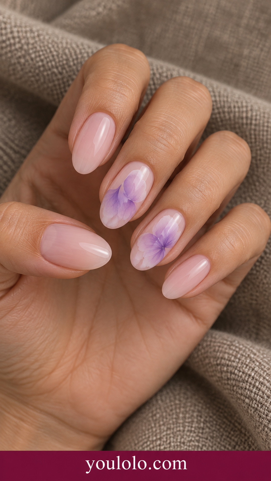
Lilac petals feel dreamy when their edges melt gently into the base. The petals do not need a hard outline to suggest a flower. I would pair this with cream or gray clothing and ask for a few separated shapes instead of filling the accent with a dense bouquet.
5. Moss Stone Veins
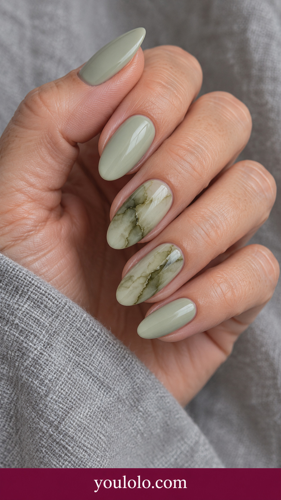
Moss-toned veining gives sage a natural-stone mood. The darker streams should vary in thickness, with pale areas still visible between them. I would choose it beside linen or a simple neutral outfit. Keep the pattern irregular so it does not become a repeated striped design.
6. Coral Watercolor Islands

Coral islands bring a warmer, sunnier direction to blooming artwork. The pale gaps make each organic patch readable. I would wear this with a cream blouse and ask for varied patch sizes; equal shapes lined up neatly would lose the loose watercolor effect.
7. Black Blush Diffusion
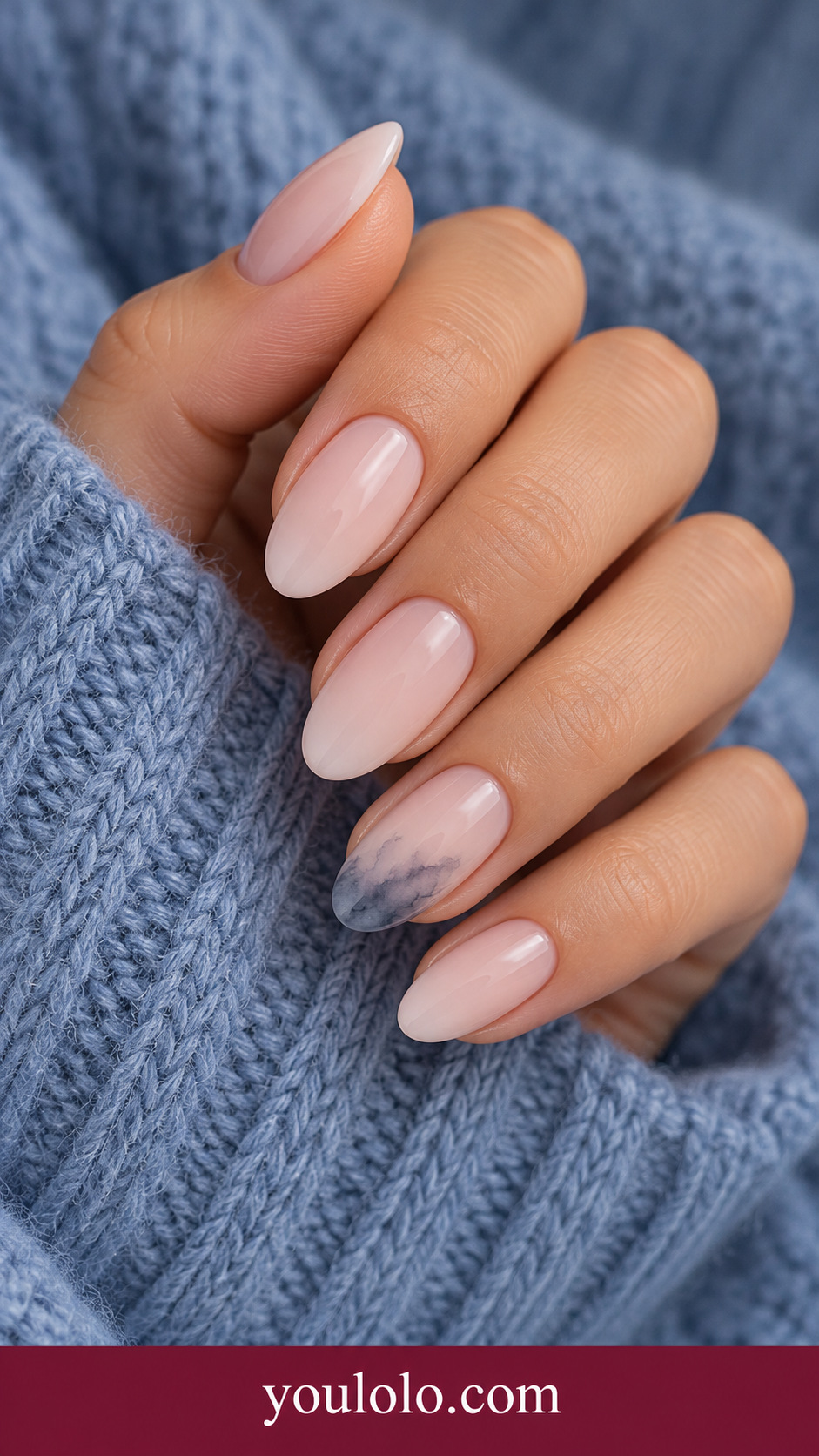
A small charcoal cloud adds contrast to blush while leaving most of the nail light. It is a quieter choice than full black marble. Ask for the darkest area near the edge with a soft fade toward the center, and keep the other nails plain.
8. Peony Halo
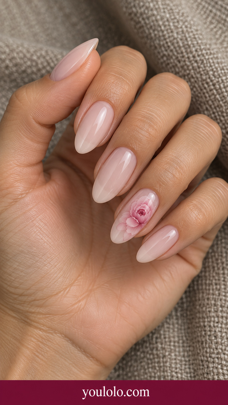
A peony-like bloom gives nude a romantic focal point. The darker center helps the pale petals stay visible without a heavy outline. I would show the reference at the actual nail size and ask for a compact flower with open space around it.
Save the Distribution, Not Every Tiny Vein
The useful reference is how much light base remains and where the deepest color sits. A flowing pattern can vary while still keeping the same mood. If the center looks too dense in a sample, discuss reducing the colored area rather than adding another pale motif over it.
9. Ocean Ring Bloom
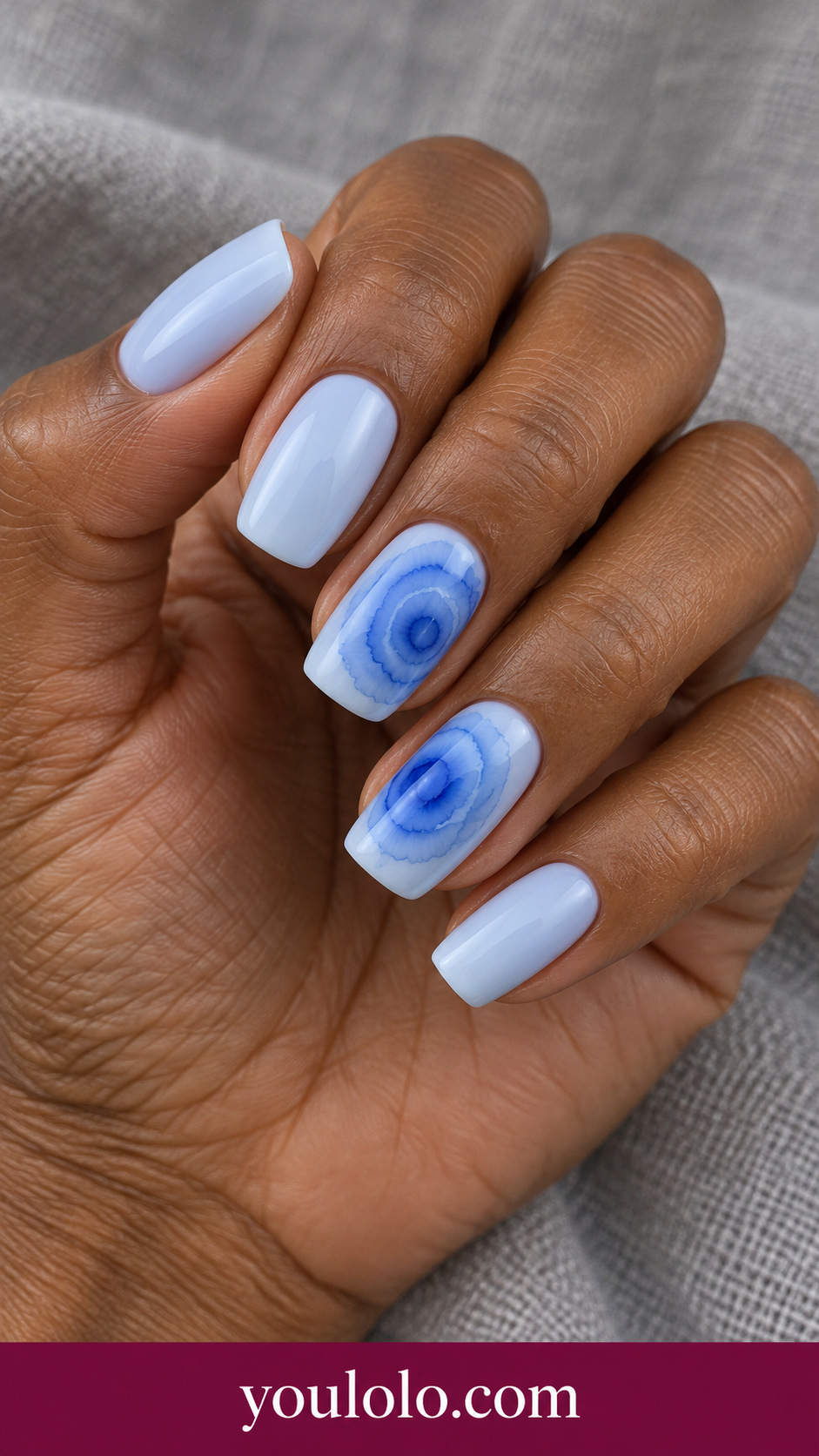
Irregular blue rings bring a different rhythm from flowing marble. Their edges stay soft, and the pale base remains visible between them. I would pair this with white or cool gray clothing. Ask for a small number of rings so the accent does not become a dense target pattern.
10. Plum Ink Wash
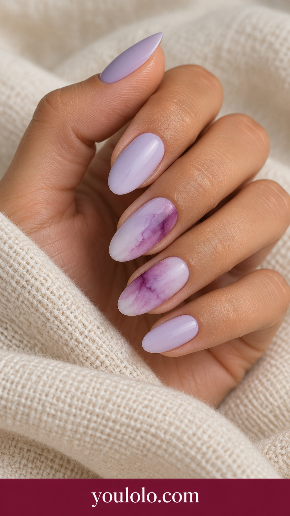
A diagonal plum wash gives lilac depth without a sharply cut color panel. The direction matters: it should move across part of the nail and leave some lighter base. I would wear it with a quiet purple or charcoal outfit and keep the neighboring tips simple.
11. Coffee Milk Marble
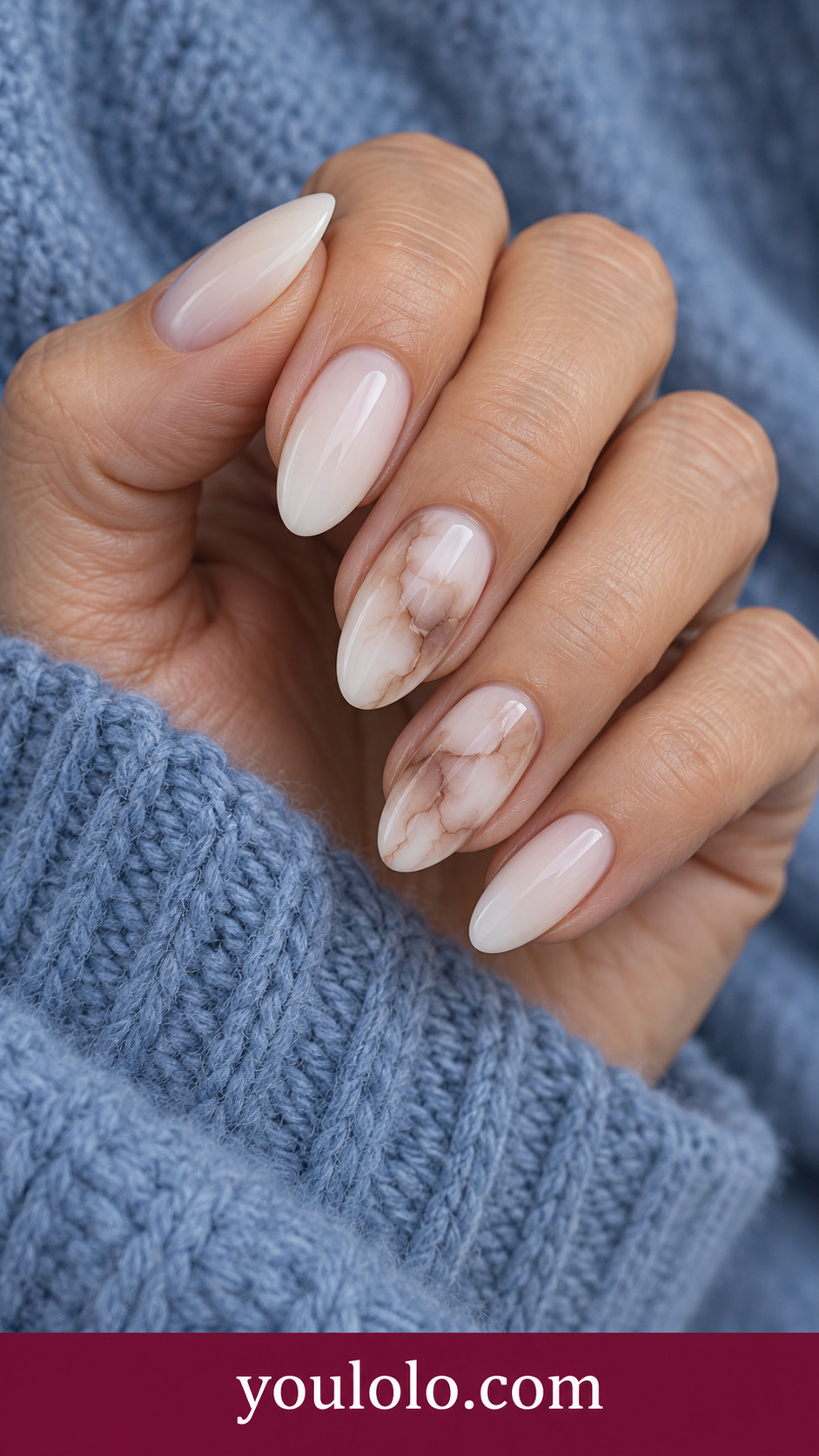
Coffee-and-milk marble makes a warm neutral palette feel more interesting through movement. The light areas are as important as the darker streams. Ask for thin, translucent coffee swirls instead of a nearly solid brown accent, especially if you want the set to feel soft.
12. Turquoise Petal Pool
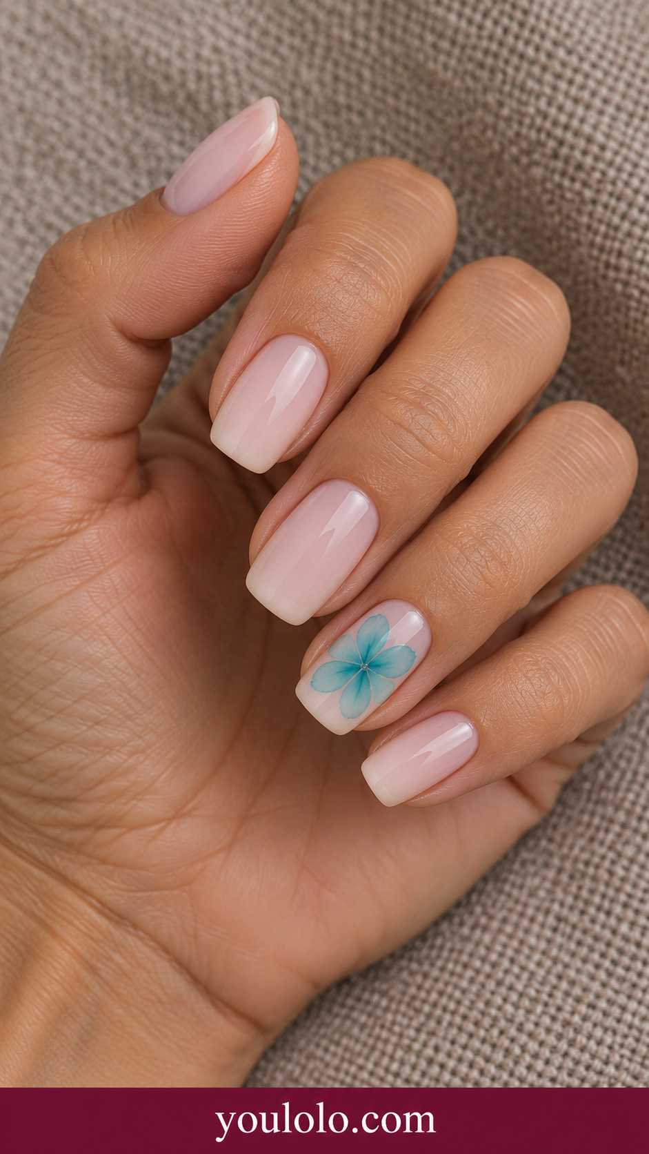
A turquoise petal pool gives nude a cool little accent. The pale center keeps the flower open and airy. I would wear it with a simple summer shirt, and ask the artist to preserve the soft petal edges rather than sharpening every outline.
13. Wine Abstract Cells
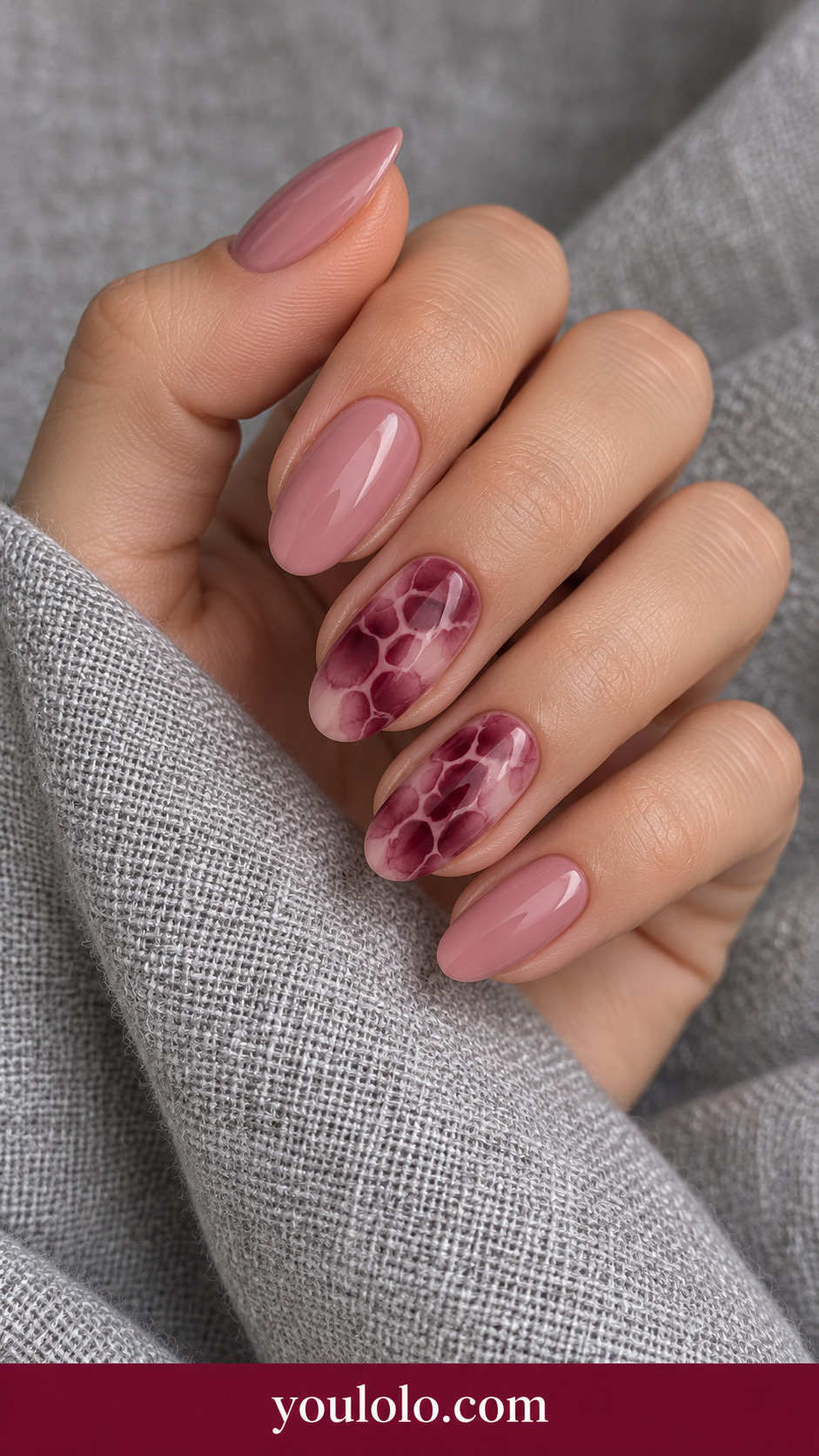
Wine-colored organic cells create a more graphic blooming result while retaining soft edges. I like it with a simple dark outfit because the pattern already has movement and contrast. Ask for irregular cell sizes and a visible rose base rather than a uniform stamped grid.
14. Apricot Cloud Fade
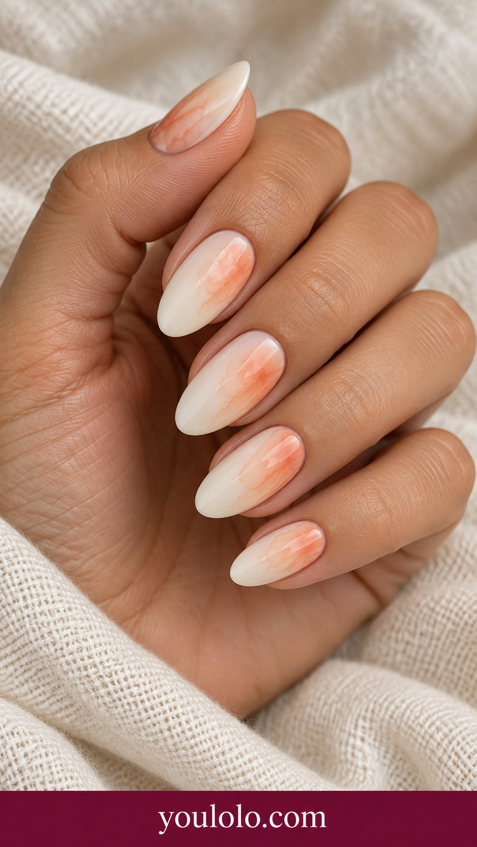
An apricot cloud gives ivory a warm, almost weightless detail. One accent is enough if you want a calm manicure. Ask for a translucent color wash that fades from the side, with no hard border or bright opaque orange patch in the middle.
15. Indigo Botanical Haze
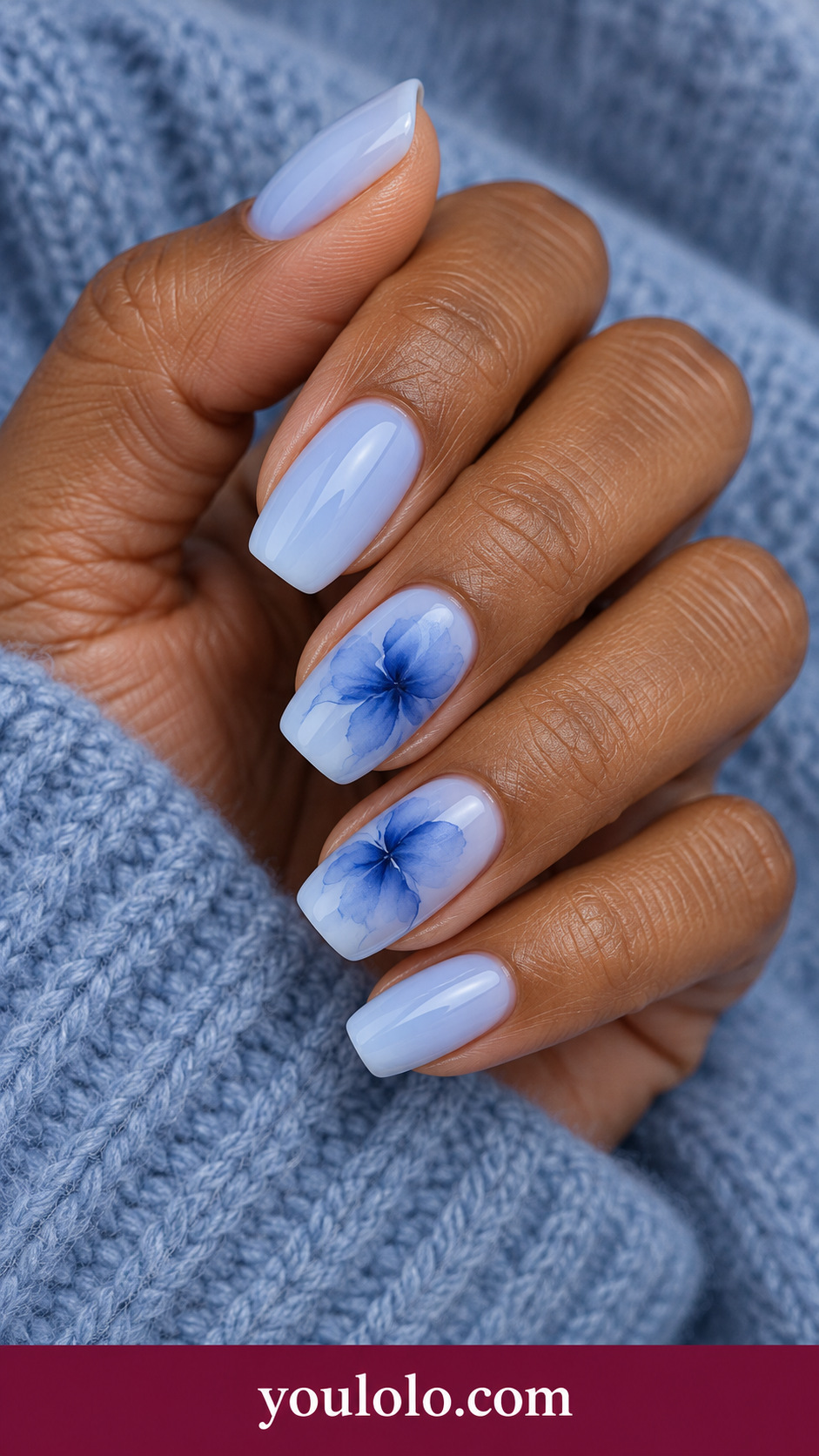
Indigo flower silhouettes feel atmospheric instead of precisely outlined. The soft blue base makes the darker shapes readable without needing a black border. I would wear this with denim or a simple white sleeve and keep the blooms separated so each has room to disperse.
16. Sage Lilac Pooling
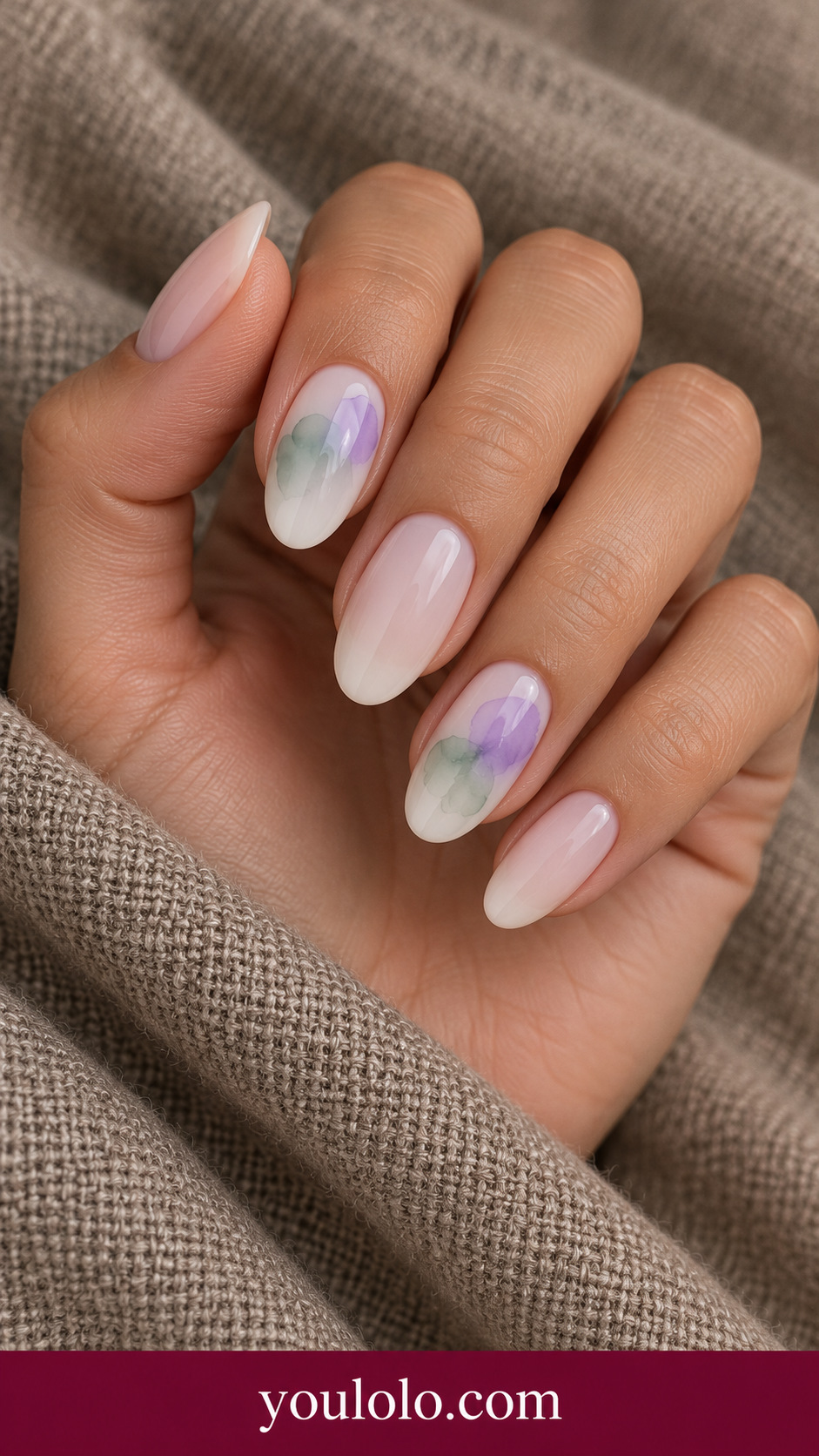
Sage and lilac create a gentle two-color bloom on nude. The overlap should remain translucent enough that the layers feel connected rather than muddy. I would compare the two shades beside a neutral outfit and ask for a few broad soft patches instead of many tiny dots.
Translate the Flow into a Salon Conversation
Choose one image for the palette and one sentence for the pattern: blue veins through a light base, or soft plum pooling with visible pale space. Ask the artist for a sample if the amount of diffusion is central to your choice.
Avoid asking for an exact copy of every tiny accidental edge. Instead, explain which parts should remain clear and where the darkest color should sit. That preserves the visual balance while leaving room for the behavior of the chosen materials.
If you prefer a single soft color glow, our aura nails explore a different composition. For crisp decorative drawing on a pale base, compare porcelain nails instead.
Blooming Gel Nail Art Questions, Answered
What is blooming gel nail art?
It is nail art made with a spreading effect that softens colored marks into patterns such as petals, veins or abstract pools. The specific product instructions determine application and curing; this gallery is a visual reference, not a universal gel tutorial.
Is blooming gel the same as hand-painted marble?
The finished looks may resemble each other, but the methods can differ. A blooming layer encourages color to disperse, while hand painting can define each vein directly. Ask for the boundary softness you prefer rather than relying only on the word marble.
Which palette looks less busy?
Choose a pale base with one or two related shades and keep open space around the spread. Coffee-milk and softer sage combinations offer quieter starting points here than a high-contrast dark cell pattern.
Will the finished pattern match the image exactly?
Treat the image as a guide to palette, distribution and softness. The exact edges can change with materials and technique. A sample helps you judge the balance before the full set is completed.