The Best Fluffy Pancakes recipe you will fall in love with. Full of tips and tricks to help you make the best pancakes.


A burgundy manicure can look red in daylight, plum in a photograph, and almost black beside a dark sleeve. Add a pearl glaze and there is another layer to choose. Glazed burgundy nails work best as a deliberate combination of base color and reflection, rather than a promise hidden in the word wine.
These 18 ideas range from simple merlot rounds to translucent wine, French edges and a few fine painted details. I would start by comparing a red-leaning and a purple-leaning sample. Once the base feels right, choosing the accent becomes much easier.
Choose the wine tone before the pearl layer
Merlot and cranberry suggest a red direction in this collection; mulberry moves toward purple, and black cherry adds depth. These names describe the visual ideas, not standardized shade formulas. Ask to see the actual base on a sample before deciding how much reflection to add.
Four ways to change the mood
- Keep it sheer: choose wine jelly with a light pearl veil.
- Keep it dark: compare black cherry and deeper merlot.
- Keep some neutral space: use a French tip, side panel, or diagonal split.
- Add a small contrast: choose one fine pale line or one tiny accent.
I would judge the dark samples away from a direct spotlight as well as beneath it. The important question is whether you still like the base when the bright reflection is less visible.
Images are individually AI-generated design references, not salon photographs or exact product swatches. Colors and reflections will vary with the actual products, base and lighting.
1. Merlot Pearl Shorts
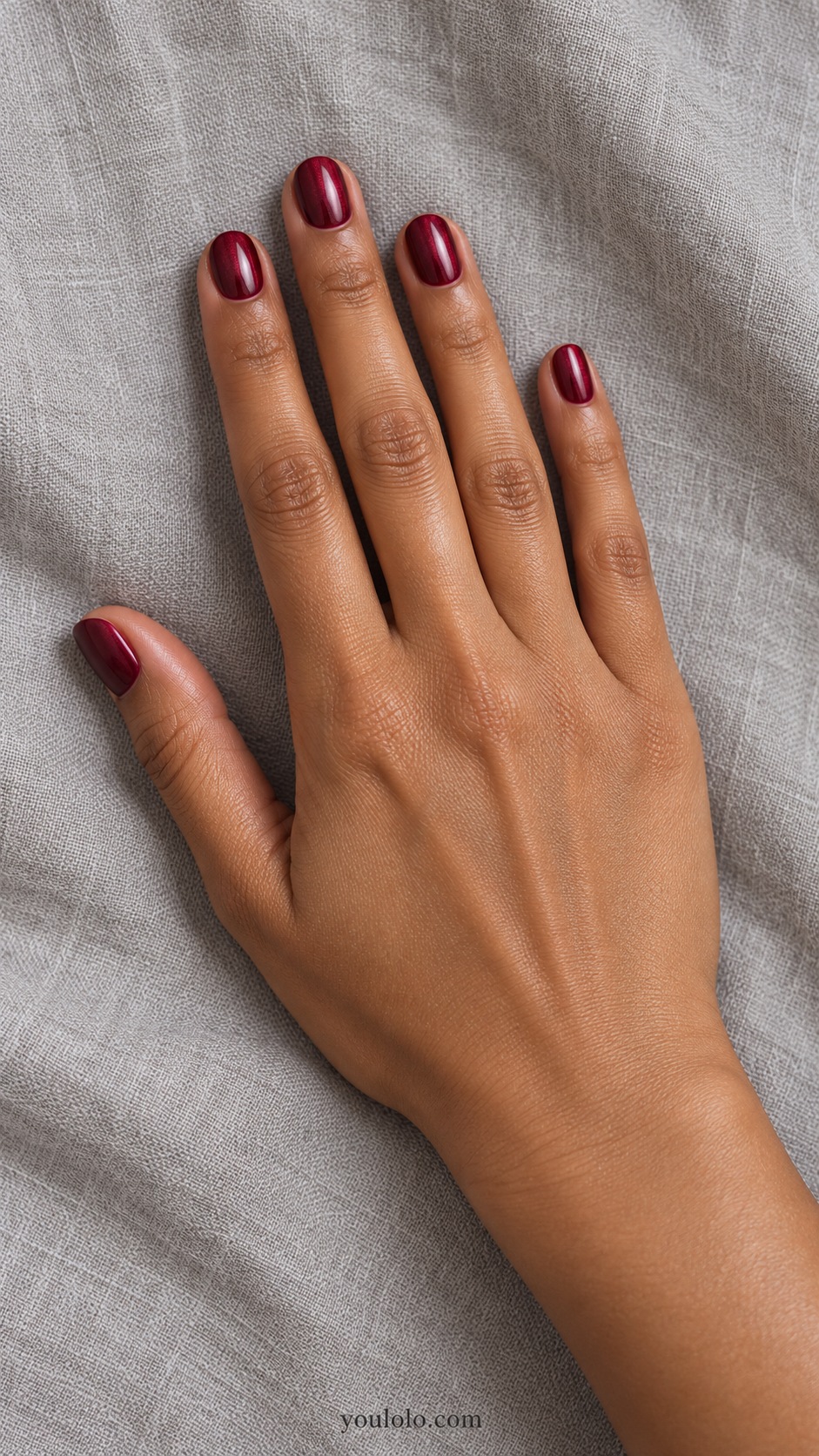
Merlot pearl gives short rounds a deep red color with a softer reflection than mirror chrome. The rosy glaze adds light without hiding the wine base. I would begin here if you want glazed burgundy nails that feel rich but do not rely on additional art.
Compare the color beside black and cream fabric. That makes it easier to see whether it reads red, brown, or purple in your usual light. Ask for enough visible burgundy beneath the sheen that the manicure does not turn into a metallic pink.
2. Black Cherry Glazed Almonds
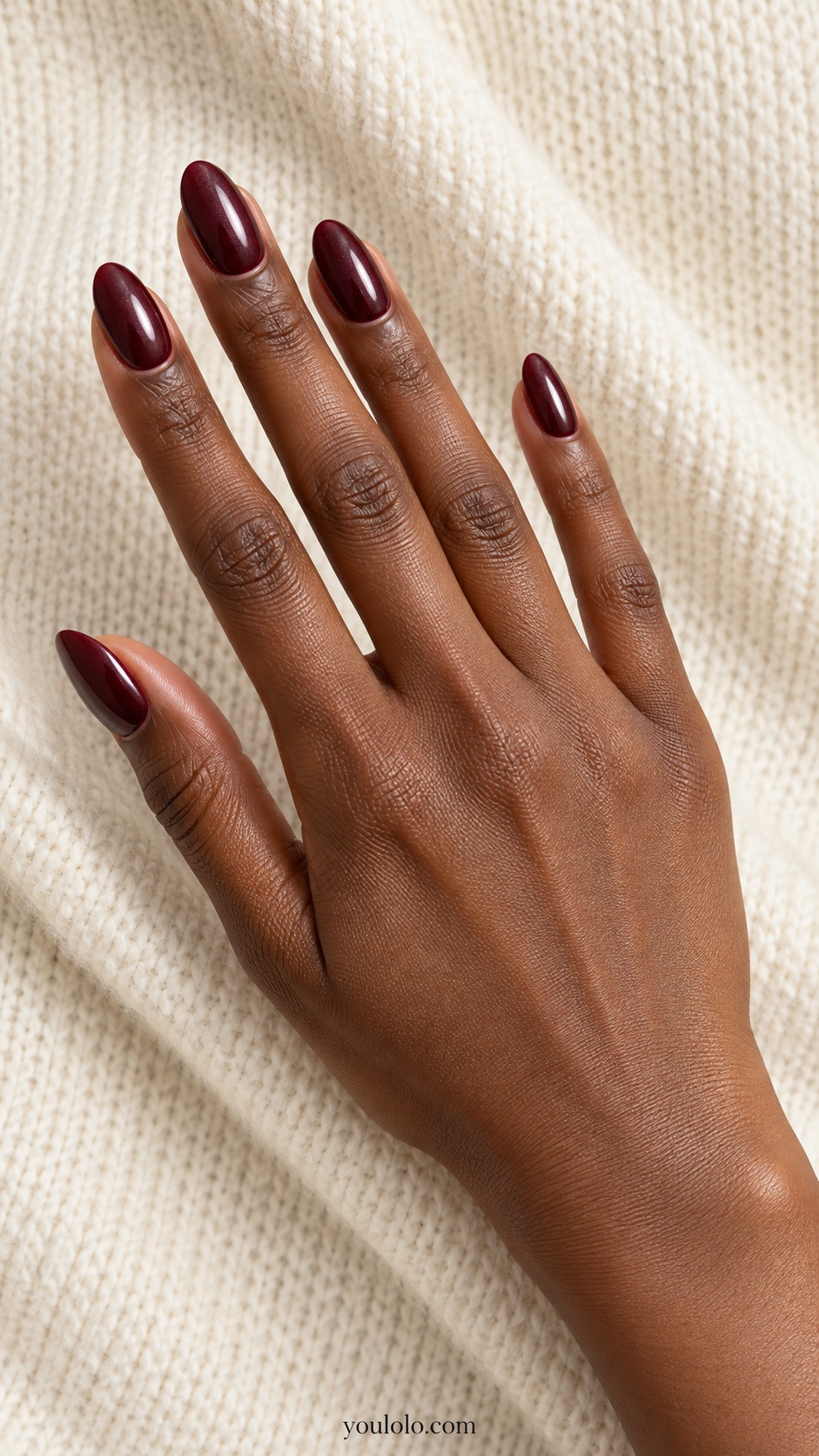
Black cherry takes burgundy close to its darkest end. A cool pearl reflection gives the almond nails some light while the base remains deep and shaded. I like this for an evening outfit with a plain neckline, where a small reflective detail can stand on its own.
Check the sample outside the strongest spotlight. If all you see is black, choose a slightly lighter cherry base rather than adding more glaze. The darker color already has presence, so I would skip stones, foil, or a separate painted motif.
3. Wine Jelly Glaze
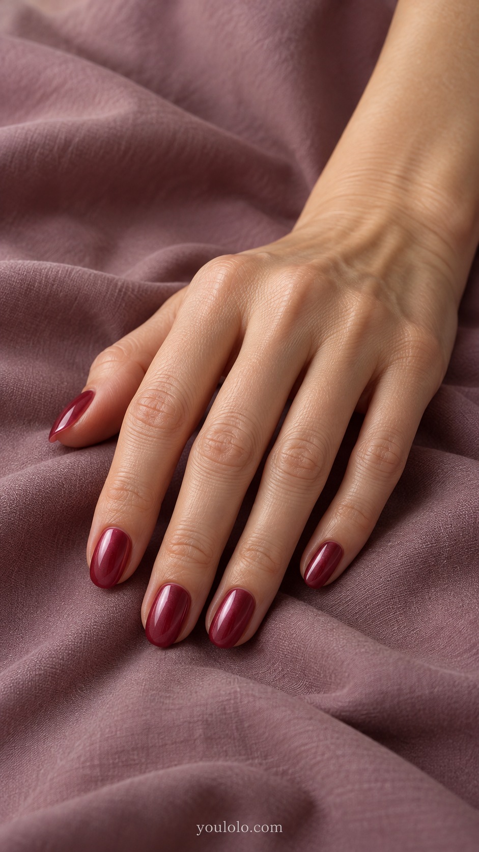
Wine jelly lets the underlying nail influence the red, creating a different kind of depth from opaque merlot. A fine pink pearl veil softens the surface without removing that transparency. Short ovals keep the look compact and leave the color as the main feature.
Ask how visible the natural free edge will be. A sheer reference does not guarantee the same effect over every base. I would choose this with a gray shirt or black knit and keep the entire set uniform so the translucent finish remains easy to notice.
4. Burgundy Pearl French
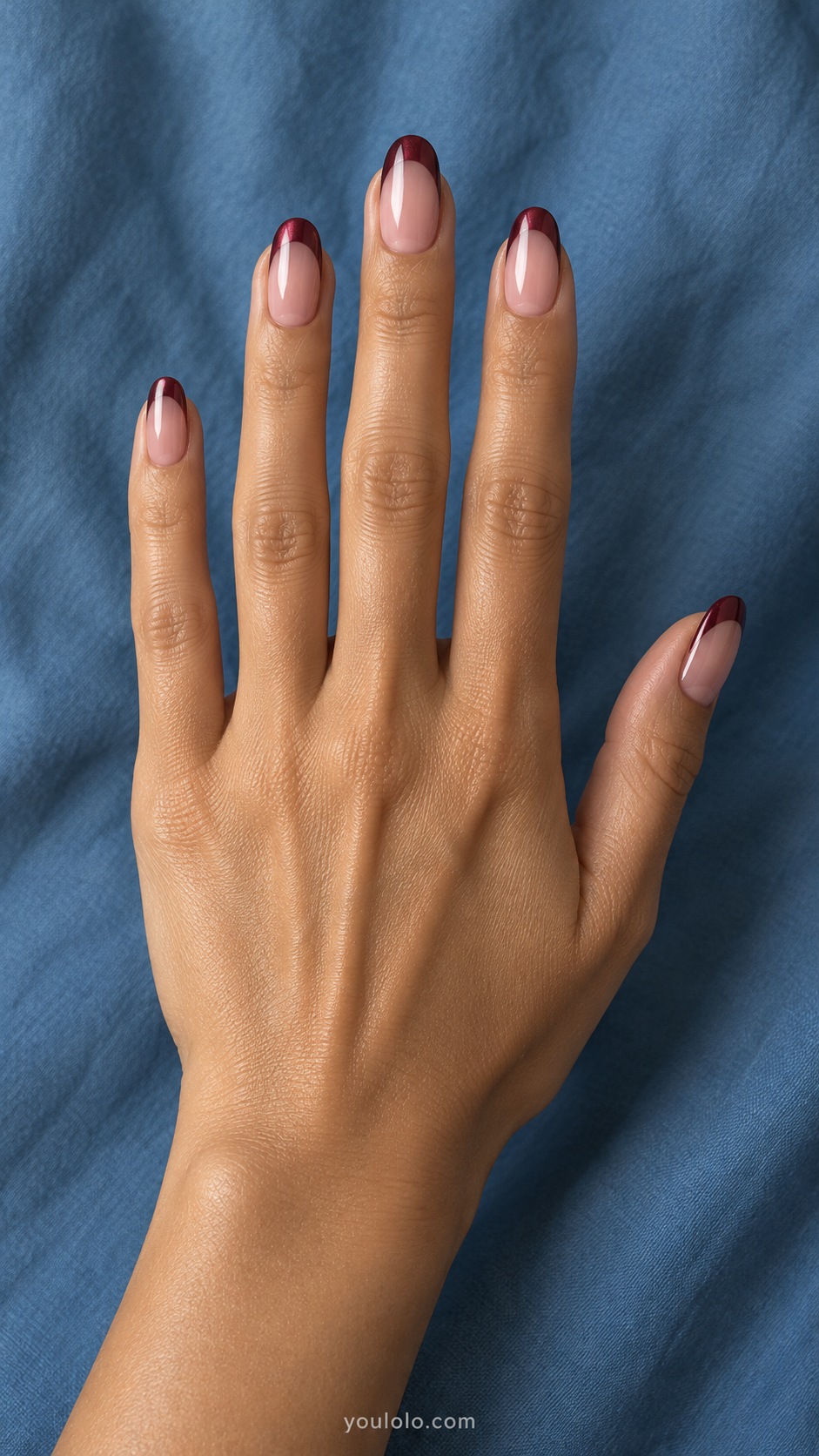
Burgundy pearl tips give a neutral manicure a darker outline. The rosy base stays open, while the oval French edge introduces wine color without covering the whole nail. This is a useful middle ground when a full dark set feels like more contrast than you want.
Choose the tip depth before choosing extra decoration. I would keep the line moderate and follow the nail's curve. A very deep French section changes the balance toward solid burgundy; a finer one leaves the neutral base in charge.
5. Garnet Milk Fade
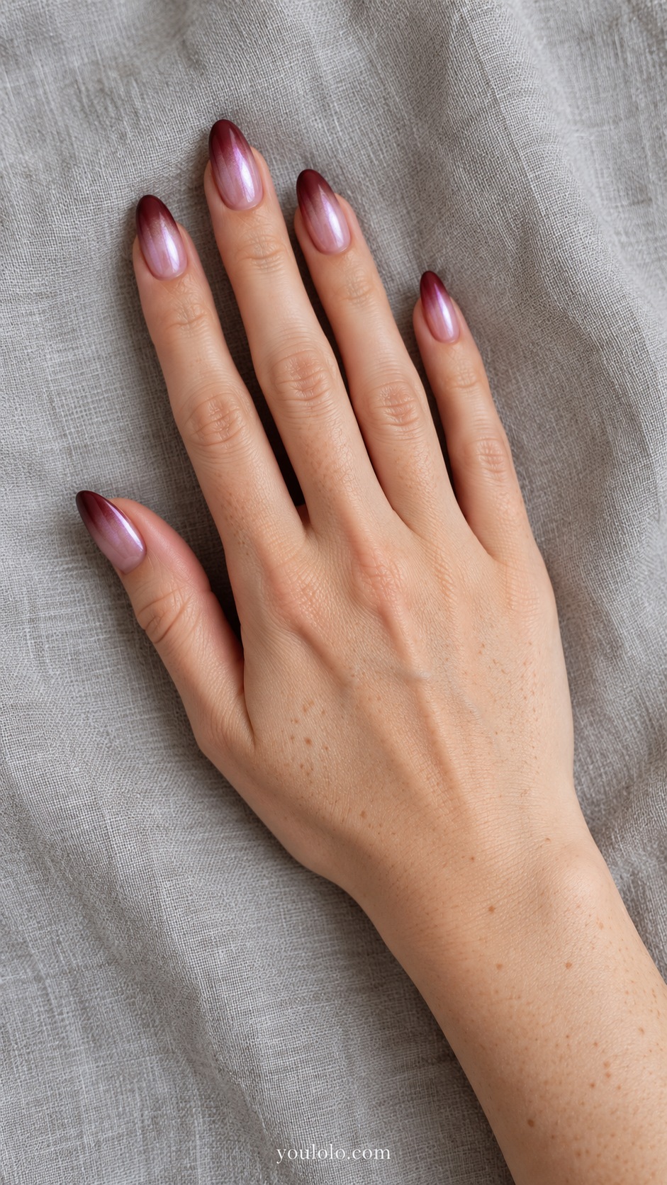
Garnet develops gradually from a pale rose base toward the almond tips. The pearl glaze connects the two colors, giving the darker end a soft reflection instead of a hard border. I like this when you want burgundy to feel lighter near the cuticle.
Ask for a blended transition rather than a pink base with a solid wine tip. On shorter nails, closer shades make that easier to read. A blush or ivory sleeve would echo the light end while letting the darker tips remain distinct.
6. Rose Gold Cuticle Thread
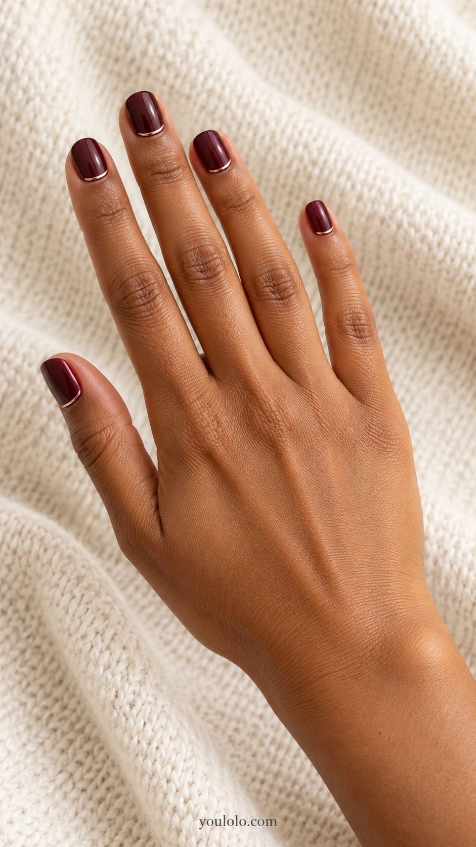
A rose-gold thread follows the base of a burgundy square. The thin warm line adds one precise accent to the pearl finish, with the rest of the nail left uninterrupted. This feels more restrained than scattering foil across the whole set.
Request flat paint and a line narrow enough to look like a detail rather than a band. I would pair it with a small warm-metal accessory. Keep the burgundy sample visible underneath the glaze so the delicate line does not compete with an overly bright surface.
7. Cranberry Pearl Side Panel
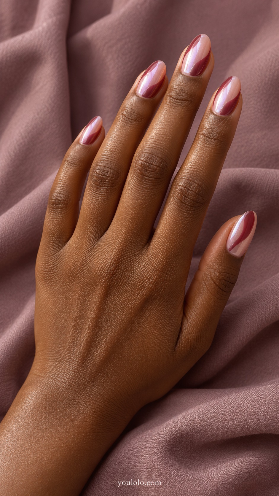
A cranberry side panel introduces wine color from one edge instead of the tip. The remaining blush area stays glazed and open, making the curved division the main design. On an oval nail, the panel has enough space to feel fluid rather than crowded.
Decide how much neutral space you want left before the artist begins. I would keep it larger than the colored area for this version. A plain dark sleeve would let the pale base and cranberry panel show their contrast clearly.
YOU MAY ALSO LIKE
If you would rather make flowers the main detail, the burgundy floral collection explores that direction separately.
8. Burgundy Blush Half Moon
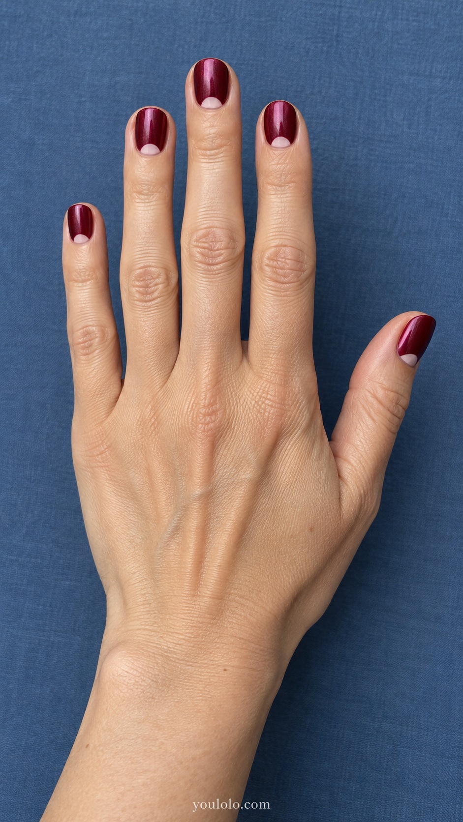
Blush half moons soften a deep burgundy round. The small pale areas sit at the base while the rest of the nail carries pearl shine, creating a simple two-color relationship. I prefer this to adding a pale French edge when I want the tips to stay dark.
Keep the half moons shallow, especially on a short nail. They should look like accents rather than half of the manicure. I would compare a warm blush and a cooler pink beside the wine base, then choose whichever feels more balanced to me.
9. Wine and Pink Duo
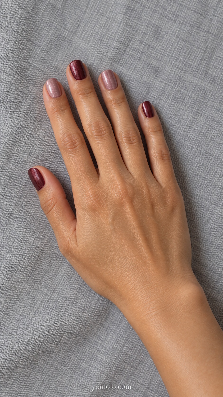
Dusty rose and burgundy alternate across short squares, sharing one pearl finish. The lighter nails give the darker color a little breathing room, while the glaze makes the pair feel connected. No drawn pattern is needed because the arrangement already supplies variation.
Choose the order before painting so the lighter shades feel deliberate. I would avoid a very bright pink that pulls attention away from the wine. This combination would work with a plain rose scarf or a gray coat without requiring an exact match.
10. Fine Ivory Wave
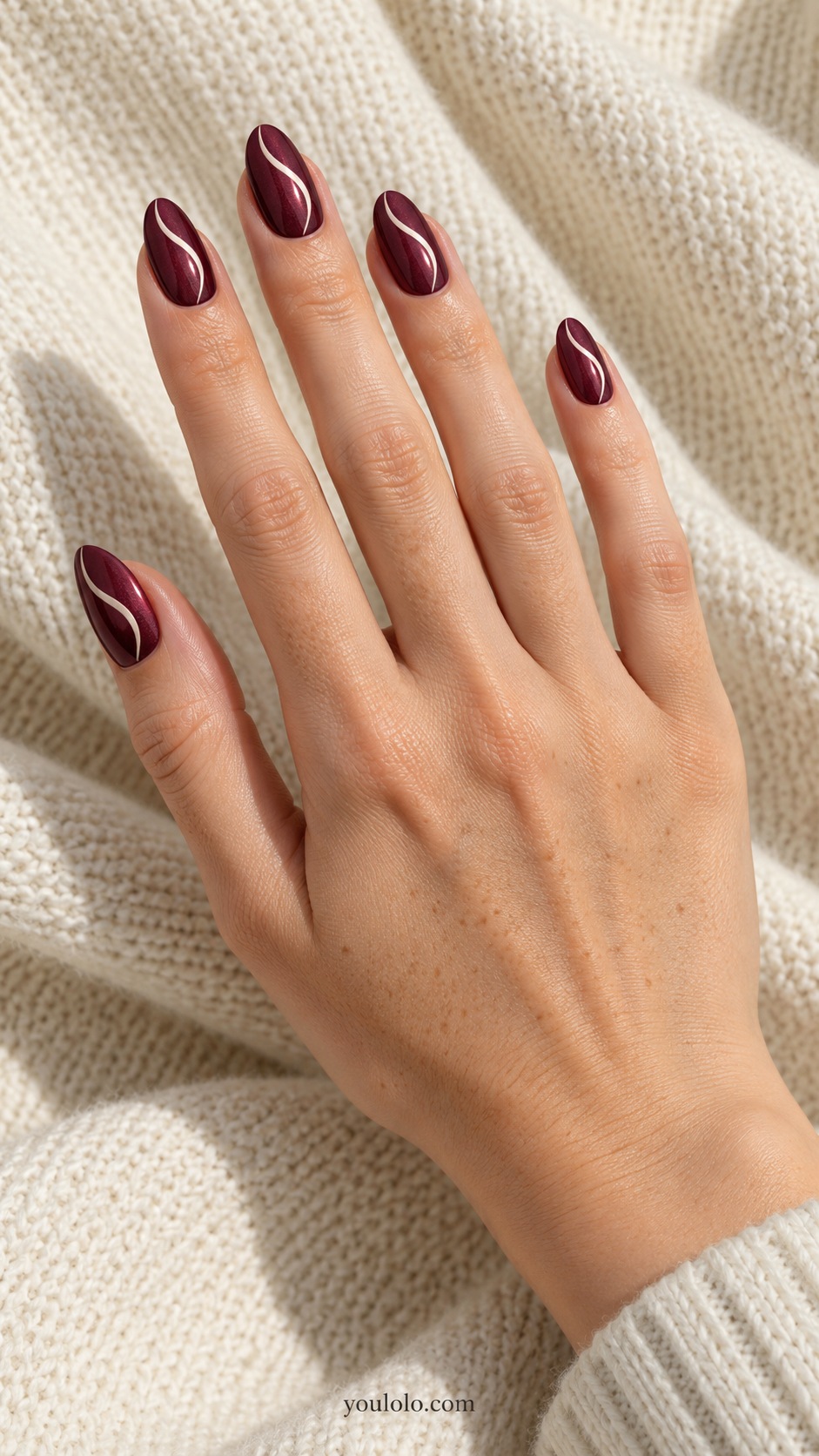
A fine ivory wave travels over burgundy pearl, adding a light line without filling the nail with artwork. The almond shape gives the curve a natural direction. I like one flowing stroke more than several overlapping swirls because the dark base still gets room to show.
Keep the line narrow and let its curve vary slightly with each nail's proportions. A thick white ribbon would become a different design. I would wear this with simple cream clothing and leave the rest of the manicure free of accents.
11. Mulberry Pearl Outline
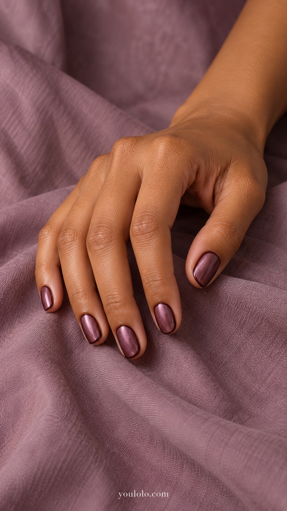
Mulberry leans toward purple, giving the pearl reflection a cooler mood than a red merlot base. A fine darker outline defines the oval without introducing a contrasting light color. The detail is subtle enough that it becomes more visible at close range.
Ask to compare the base and border together. If they are indistinguishable, deepen the outline slightly rather than widening it. I would choose this for someone who prefers quiet tonal art and pair it with charcoal, navy, or a muted lilac accessory.
12. Merlot Tuxedo Tip
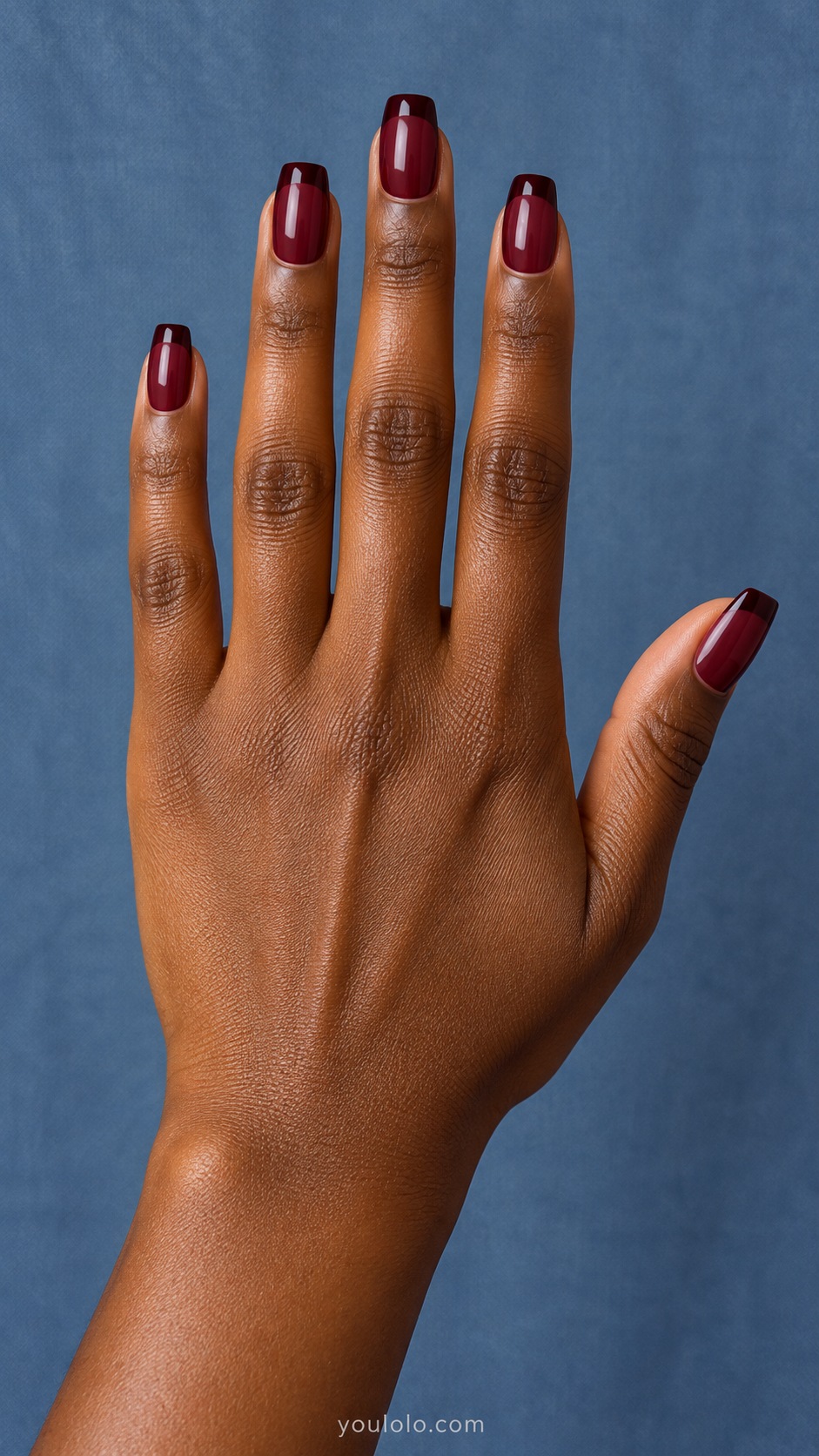
A near-black wine tip adds a narrow edge to burgundy glaze. The square shape makes that straight band easy to read, but the related colors keep it understated. This feels like a dark, tonal French manicure rather than a high-contrast red-and-black pattern.
Check the band in ordinary light before deciding it is dark enough. I would keep it narrow so the pearl burgundy remains the main surface. A plain black jacket echoes the border while the red undertone prevents the nails from disappearing into the outfit.
13. Berry Glaze Heart Accent
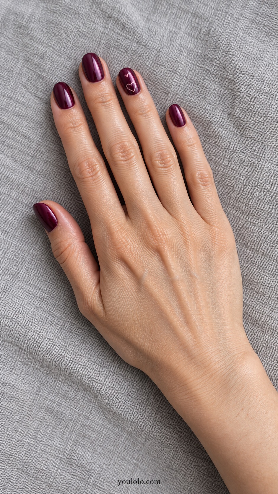
One small outlined heart gives berry pearl a softer accent. The pale pink drawing sits near the base of a single nail, leaving most of the dark surface open. It is a way to add a romantic detail without turning the entire set into a themed pattern.
Use a fine outline rather than a filled shape if you want to preserve the airy effect. A very short nail may need an even smaller heart. I would keep the other fingers plain and let the difference in scale make the accent feel intentional.
14. Wine Pearl Diagonal
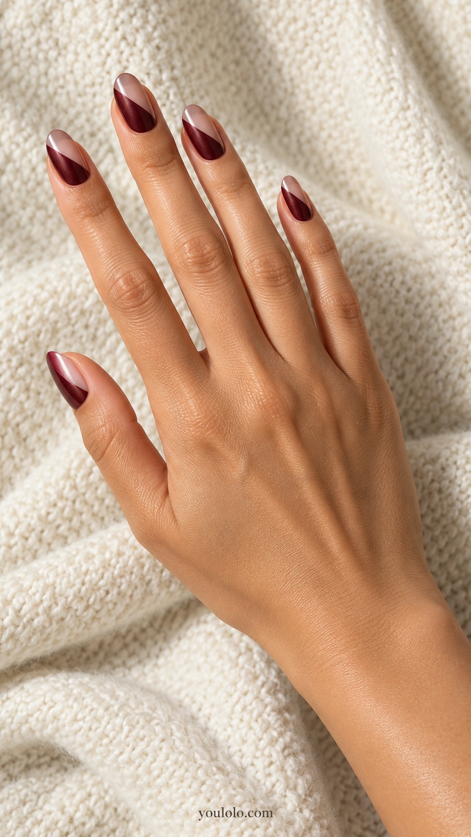
A diagonal division pairs translucent rose beige with opaque burgundy pearl. The two finishes share shine but differ in coverage, which makes the angled seam clear. Oval nails soften the geometry, so the design feels less rigid than a square color block.
Ask which corner will carry the dark section and how much neutral area remains. I would keep the division consistent across the hand without forcing identical widths on every nail. A simple ivory sleeve gives both halves a clear background.
15. Burgundy Pearl Pinstripe Accents
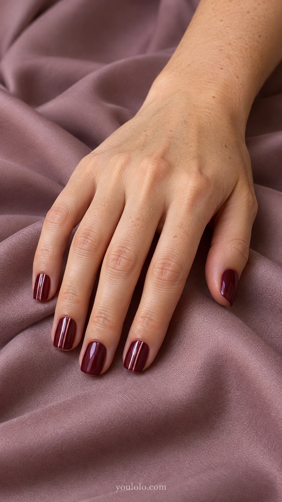
Pale rose pinstripes decorate selected burgundy squares. The other nails remain plain, keeping the pattern concentrated rather than repeated everywhere. The vertical lines contrast with the straight free edge and add detail without introducing a new color family.
Keep a visible gap between the stripes. If they sit too close together, they can look like one thick line. I would leave at least one nail plain and keep the pearl sheen fine enough that the pale marks remain easy to read.
YOU MAY ALSO LIKE
For more patterns and a broader dark-red palette, compare the maroon nail-art guide before choosing your final accent.
16. Smoked Wine Side Fade
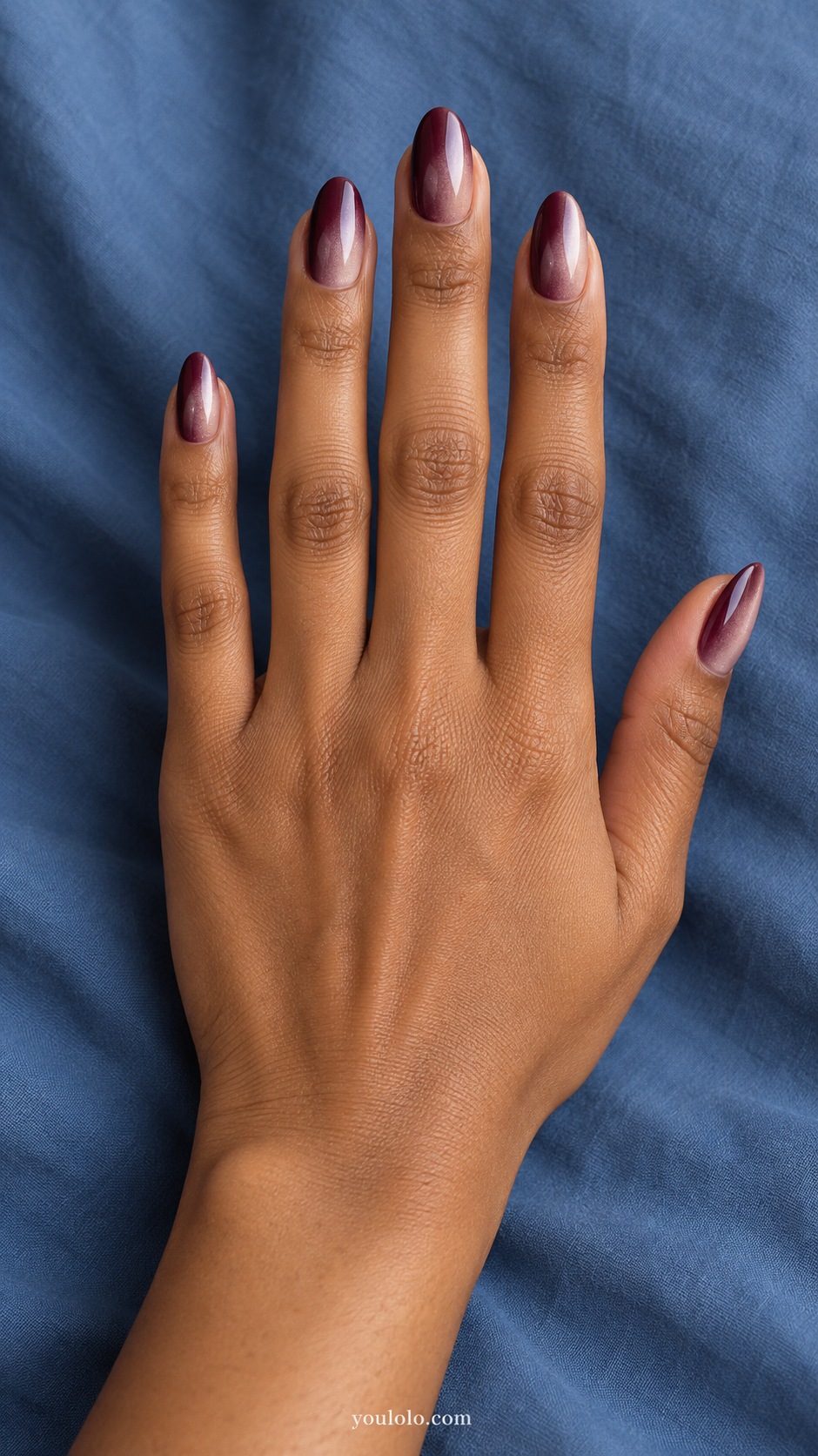
A side-to-side fade moves from deep burgundy into smoky rose. Unlike a gradient that darkens at the tip, this shifts across the width of the almond nail. The fine pearl veil makes the transition feel soft while the darker side preserves the wine mood.
Show the artist the direction of the fade explicitly. I would keep the darkest edge narrow enough that the lighter area still feels intentional. A charcoal outfit supports the cool smoke tone without making the burgundy look overly bright.
17. Plum Wine Glazed Marble
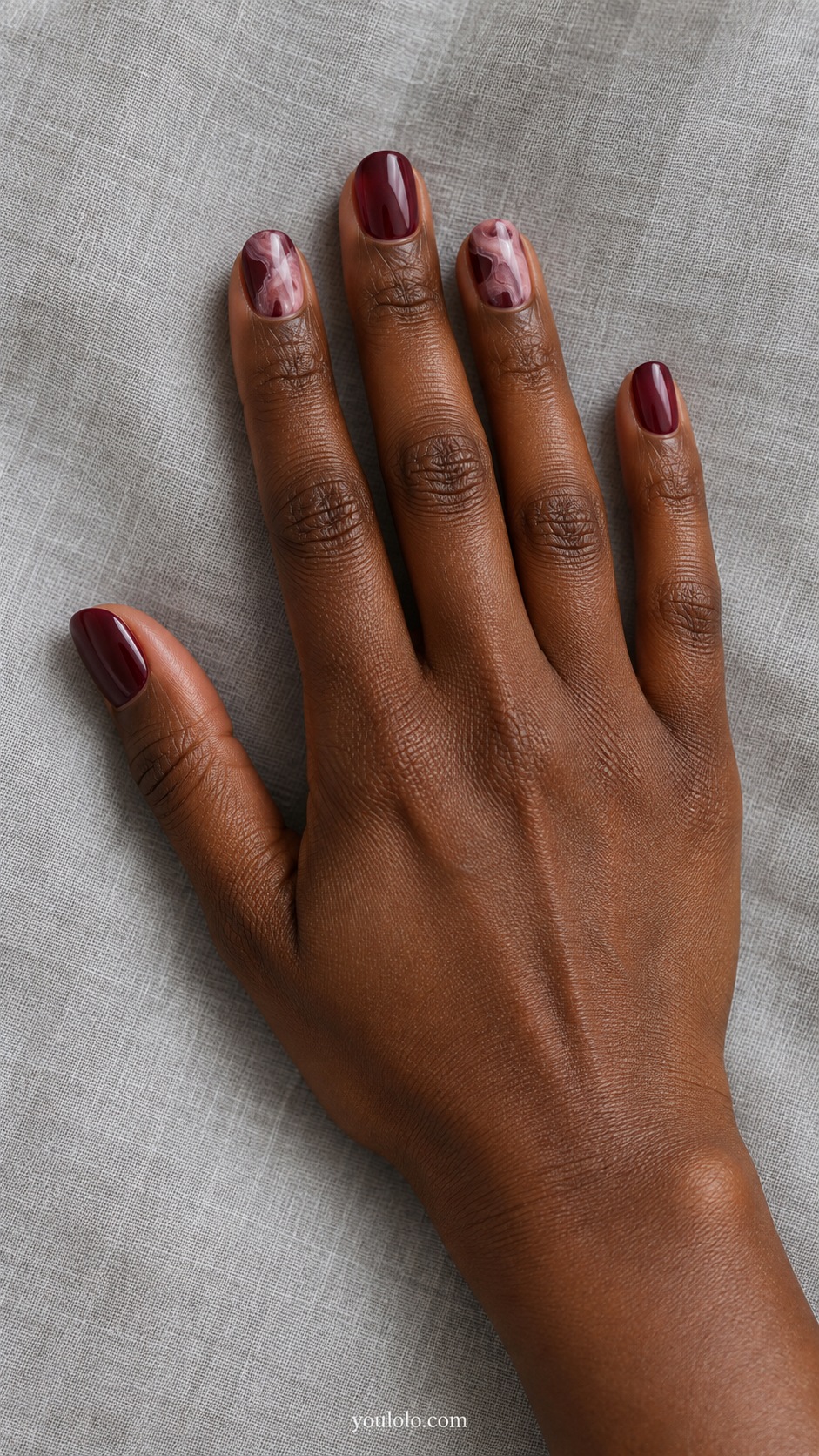
Dusty pink marble wisps soften two burgundy nails while the rest stay plain and pearly. The irregular marks should feel light, with plenty of dark base between them. I prefer this narrow palette to adding white, gold, and black veins at once.
Ask for fine, loose marks rather than a dense stone pattern. On short ovals, a few well-spaced wisps will read more clearly. I would wear it with an unpatterned knit so the small variations in the marble have room to be noticed.
18. Burgundy Pearl Rim French
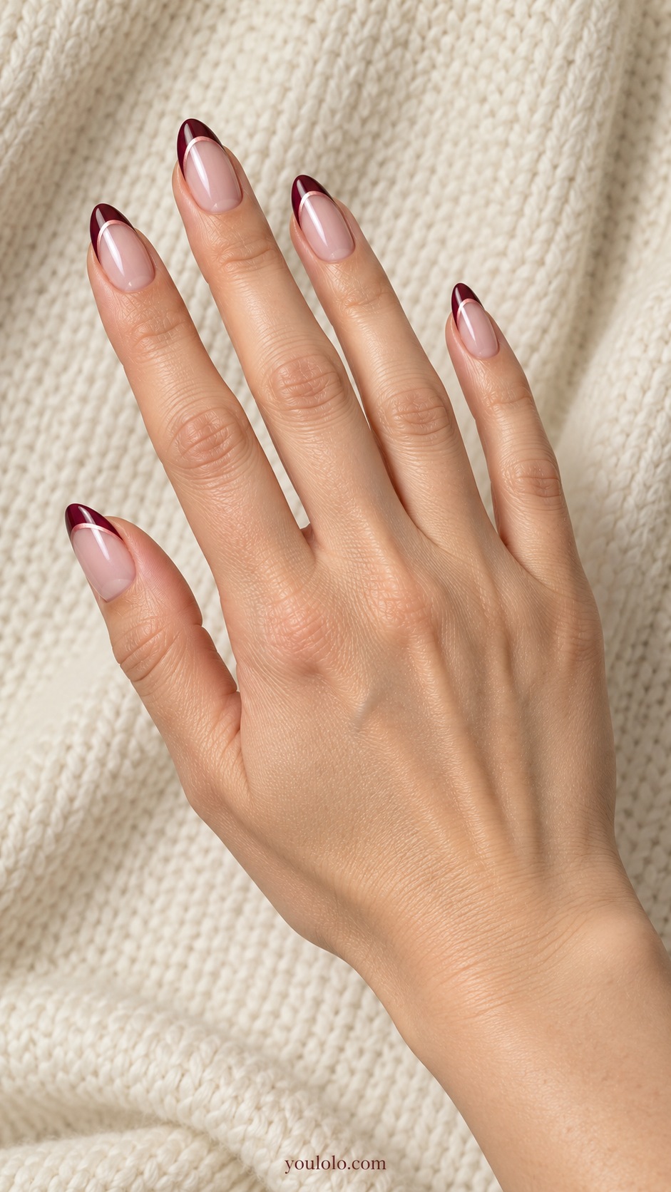
A fine pale rose seam follows the inside of a burgundy French tip. The nude blush base remains pearly and open, giving the dark edge and lighter line separate roles. Almonds allow the border to curve without making it too broad.
Check the spacing before adding the seam to every nail. It should trace the French boundary, not create a second large tip. I would keep the rose line softer than white and choose a plain sleeve to support the carefully outlined edge.
How I would style glazed burgundy nails
Cream gives the wine color a clear contrast. Gray can make a purple-leaning burgundy feel more obvious, while a warm brown sleeve may bring out its earthier side. I would compare the manicure sample beside those fabrics rather than decide from the bottle alone.
For an outfit with lace, flowers, or a strong print, a plain merlot pearl keeps the manicure simple. With a plain knit, a small heart, pinstripe pair, or marble accent has more space to be noticed. The finish itself already supplies detail, so extra artwork is optional.
Our glazed nail ideas can help you compare a darker wine base with lighter pearl finishes.
A salon brief for wine color that stays visible
Try: “A red-leaning burgundy base, short ovals, and a fine rosy pearl reflection. I want it to stay wine-colored in ordinary light.” For a French version, add the depth of the tip and how sheer you want the neutral base.
OPI distinguishes lacquer glaze toppers from chrome powders. Ask the artist which route matches the reference and follow that product system’s instructions.
My starting picks are plain merlot for color, wine jelly for transparency, and the burgundy French for a lighter overall effect. Choose one of those directions before adding a line or accent.
Glazed Burgundy Nails FAQ
What is the difference between burgundy and maroon?
The labels overlap between brands and everyday use. Burgundy often suggests a wine or purple-red direction, while maroon may appear browner, but the actual swatch matters more than the name.
Why do my saved burgundy references look almost black?
A deep base, lighting, camera settings and surrounding colors can all affect how dark the image appears. Ask to compare the real sample in ordinary light before choosing the darkest shade.
Can glazed burgundy nails be subtle?
A short shape, a fine pearl veil, or a narrow French edge can make the overall look more restrained. The design will still have more contrast than a pale neutral, especially against lighter clothing.
Do I need magnetic polish for the wine glow?
No. A smooth pearl reflection is different from a concentrated magnetic highlight. Show the effect you mean; the designs here focus on pearl glaze rather than cat-eye bands.
Which accent color would you choose?
For this collection, I would start with ivory, pale rose or a fine rose-gold line. Each gives a different level of contrast. Compare it with the finished burgundy sample before repeating it across the set.
Can I combine a glazed base with flat painted artwork?
That is the visual idea behind several designs here. Ask the nail artist how they would create the combination with their products; a reference does not specify a universal layering or curing sequence.


[…] reflection is the feature you want, compare our separate glazed burgundy nails. This collection gives more attention to painted geometry and negative […]